Georgia Uniforms
Moderators: PonyPride, SmooPower
29 posts
• Page 2 of 2 • 1, 2
Re: Georgia Uniforms
![]() by Big Hoss » Sun Sep 04, 2011 5:51 am
by Big Hoss » Sun Sep 04, 2011 5:51 am
Oh yeah, that's it. Still doesn't change the fact that those unis are hideous.
- Big Hoss

- Posts: 3181
- Joined: Tue Dec 11, 2007 3:02 pm
- Location: DFW, Texas
Re: Georgia Uniforms
![]() by hoopmanx » Sun Sep 04, 2011 7:20 am
by hoopmanx » Sun Sep 04, 2011 7:20 am
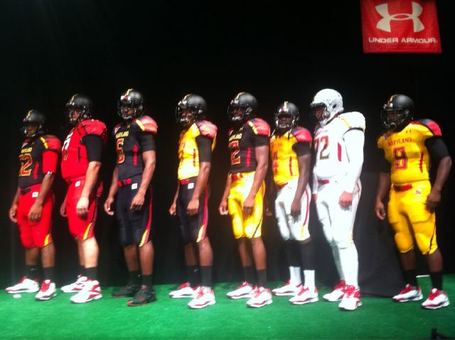
This thread reads like a bunch of middle-aged to old white guys. Guess what? the new-fangled uniforms are a massive recruiting tool. Wait till you guys see what Maryland wears vs Miami tomorrow? The state flag helmet puts anything Oregon has ever done to shame.
Also, for those hating the UGA uniforms, where's the love for the Boise uni's?
Also, for those hating the UGA uniforms, where's the love for the Boise uni's?
-

hoopmanx - Posts: 4871
- Joined: Sat Sep 25, 2010 8:36 am
Re: Georgia Uniforms
![]() by Arkpony » Sun Sep 04, 2011 7:25 am
by Arkpony » Sun Sep 04, 2011 7:25 am
No...Art is art...Hideous is still hideous...ugly is ugly
Long live Inez Perez!
-

Arkpony - Posts: 6465
- Joined: Thu Feb 06, 2003 4:01 am
- Location: Little Rock, AR USA
Re: Georgia Uniforms
![]() by GiddyUp » Sun Sep 04, 2011 8:08 am
by GiddyUp » Sun Sep 04, 2011 8:08 am
hoopmanx wrote:This thread reads like a bunch of middle-aged to old white guys. Guess what? the new-fangled uniforms are a massive recruiting tool. Wait till you guys see what Maryland wears vs Miami tomorrow? The state flag helmet puts anything Oregon has ever done to shame.
Also, for those hating the UGA uniforms, where's the love for the Boise uni's?
Not really - read the entire internet web /twitter and people are saying the same thing. Someone said Georgia looked like Power Rangers - made me laugh.
But, the players probably loved them...
-

GiddyUp - Posts: 8227
- Joined: Thu Feb 03, 2011 5:48 pm
Re: Georgia Uniforms
![]() by MustangStealth » Sun Sep 04, 2011 8:25 am
by MustangStealth » Sun Sep 04, 2011 8:25 am
They looked like they belonged in Arena football or the XFL. And they should have been called the Xtreme Dawgs.
-
MustangStealth - Posts: 4093
- Joined: Thu Nov 15, 2001 4:01 am
- Location: Ford Stadium, as often as possible
Re: Georgia Uniforms
![]() by SMU21TCU10 » Sun Sep 04, 2011 10:57 am
by SMU21TCU10 » Sun Sep 04, 2011 10:57 am
lwjr wrote:Georgia uniforms remind me of a fire hydrant
The helmets look like a bass boat
-

SMU21TCU10 - Posts: 4347
- Joined: Wed Jan 16, 2008 8:07 pm
- Location: Mos Eisley, Tatooine
Re: Georgia Uniforms
![]() by smupony94 » Sun Sep 04, 2011 11:00 am
by smupony94 » Sun Sep 04, 2011 11:00 am
And yet, people can't stop talking about them
-

smupony94 - Posts: 25665
- Joined: Mon Mar 01, 2004 11:34 am
- Location: Bee Cave, Texas
Re: Georgia Uniforms
![]() by PonyPride » Sun Sep 04, 2011 11:02 am
by PonyPride » Sun Sep 04, 2011 11:02 am
hoopmanx wrote:This thread reads like a bunch of middle-aged to old white guys. Guess what? the new-fangled uniforms are a massive recruiting tool. Wait till you guys see what Maryland wears vs Miami tomorrow? The state flag helmet puts anything Oregon has ever done to shame.
Also, for those hating the UGA uniforms, where's the love for the Boise uni's?
Good point — didn't like Boise State's helmets with the oversized logo on one side, either.
PonyFans.com ... is really the premier place for Mustang talk on the Web.
— New York Times
https://www.facebook.com/PonyFanscom/
twitter.com/PonyFans
https://www.instagram.com/ponyfans_staff/
threads.com/ponyfans_staff
— New York Times
https://www.facebook.com/PonyFanscom/
twitter.com/PonyFans
https://www.instagram.com/ponyfans_staff/
threads.com/ponyfans_staff
-

PonyPride - Posts: 22466
- Joined: Sat Apr 01, 2000 4:01 am
- Location: Dallas, Texas
Re: Georgia Uniforms
![]() by leopold » Sun Sep 04, 2011 11:18 am
by leopold » Sun Sep 04, 2011 11:18 am
Actually, I liked Boise's. It was cleaner, and the oversized bronco head looked good to me. Actually like an NFL team, not a Arena Football league team.
But whatever. Even a blind squirrel finds a nut. Never thought I would like BSU's uniforms more than an SEC team's.
But whatever. Even a blind squirrel finds a nut. Never thought I would like BSU's uniforms more than an SEC team's.
-

leopold - Posts: 4112
- Joined: Sat Feb 01, 2003 4:01 am
- Location: Columbia, SC
Re: Georgia Uniforms
![]() by leopold » Sun Sep 04, 2011 11:27 am
by leopold » Sun Sep 04, 2011 11:27 am
hoopmanx wrote: Wait till you guys see what Maryland wears vs Miami tomorrow? The state flag helmet puts anything Oregon has ever done to shame.
Actually, they aren't hideous. Not good, but not embarrasing. The state-flag-as-a-stripe would work if they did more with it.
http://www.umterps.com/sports/m-footbl/ ... 11aac.html
-
leopold - Posts: 4112
- Joined: Sat Feb 01, 2003 4:01 am
- Location: Columbia, SC
Re: Georgia Uniforms
![]() by PoconoPony » Sun Sep 04, 2011 3:45 pm
by PoconoPony » Sun Sep 04, 2011 3:45 pm
Oregon uniforms are simply hideous. The uniforms blended with the green field making them almost unwatchable on TV. Uniform numbers could not be readily read from game action cameras making quick player identification impossible without TV announcers making identifications. Boise uniforms only slightly better. Bronco on helmit was terrible, did not look like a readily identifible mascot logo and illogically was located only on the left side of the helmit. Why a logo on only one side of helmit???? Georgia uniforms simply ugly. Georgia pants needed some contrast or markings to off set too much red which was very boring and not at all interesting.
- PoconoPony
- Posts: 4436
- Joined: Mon Aug 25, 2008 8:01 pm
- Location: Nesquehoning, Pennsylvania
Re: Georgia Uniforms
![]() by Waldorf » Sun Sep 04, 2011 3:55 pm
by Waldorf » Sun Sep 04, 2011 3:55 pm
Bronco on helmit was terrible, did not look like a readily identifible mascot logo and illogically was located only on the left side of the helmit. Why a logo on only one side of helmit????
They were either too cheap to buy two decals, or when they counted helmets they forgot to multiply by 2.
If you live a long life,
It will be a testament to your friends' self control
It will be a testament to your friends' self control
-

Waldorf 
- Posts: 230
- Joined: Thu Nov 29, 2007 1:30 pm
- Location: Stage Left Balcony
Georgia Uniforms
![]() by couch 'em » Sun Sep 04, 2011 4:09 pm
by couch 'em » Sun Sep 04, 2011 4:09 pm
I kind of like the Boise helmet. It's not like they have a classic quality helmet to use like SMU or UT. Why not trick it up?
"I think Couchem is right."
-EVERYONE
-EVERYONE
-

couch 'em - Posts: 9758
- Joined: Wed Sep 04, 2002 3:01 am
- Location: Farmers Branch


29 posts
• Page 2 of 2 • 1, 2
Who is online
Users browsing this forum: Google [Bot] and 1 guest