MrMustang: Your point about choosing to wear the clothes or choosing to attend the games is well taken. Forgive me for placing the cart before, ahem, the horses.
EastStang: Andy Rooney I am not. I'll try to tone down my idealism a hair.
Just to make sure that we are all on the same page here: SMU is not changing the official logo or block letters of the University, a la the admissions website linked by MrMustang. The changes only affect athletics. Could this be because, oh I don't know, the block letters look academic, whereas the new lettering looks more, oh how do you say it, sporty? Is it possible for SMU to have, gasp, two letter styles: one for academics and one for athletics? Granted we have had two styles all along really, but this most recent change only further distinguishes the two styles. I have no problem with having two styles-- most of our benchmark schools do the exact same thing! Just look at the websites for our competing schools, and you'll see a font reserved purely for athletics. In this regard, SMU is playing catch-up! We reserve the old, conservative lettering for academics/admissions/student life, etc. and give athletics a distinct letter style along with a running mustang, which isn't going away (contrary to whatever The Daily Campus may say). At some point all these other universities had to make the decision to adopt a sporty style for athletic logos, and it seems SMU is simply joining the ranks of most, if not all, of our competitors. Am I to believe that SMU is too proud (or what have you) to stoop to the level of other universities? Is it really such a sin to take on a logo that looks similar to so many of our competitors? Perhaps we should get off our, ahem, high horses.
www.mustanglockerroom.com
Moderators: PonyPride, SmooPower
![]() by EastStang » Tue Jul 12, 2005 4:48 pm
by EastStang » Tue Jul 12, 2005 4:48 pm
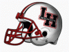
When did TT, OU, UH, UT, Ohio State, Michigan, ND and A&M adopt new logos? Answer they didn't. TCU did, but they change logos and colors every 5 years. Remember those pastel purple (mauve) uniforms they had for awhile? Sure some CUSA teams changed logos. Tulane has on occasion. Tulsa has, but then when you're called the Golden Hurricanes what can you do? The running Mustang, the Longhorn, OU and the ATM are four of the most recognizable logos in America. Why change that?
- EastStang

- Posts: 12673
- Joined: Fri Feb 15, 2002 4:01 am
![]() by CalallenStang » Tue Jul 12, 2005 4:57 pm
by CalallenStang » Tue Jul 12, 2005 4:57 pm
The running mustang gave SMU it's only top 10 ranking last season: http://sportsillustrated.cnn.com/2004/w ... index.html
7. Southern Methodist University -- It's another horse, this one a red mustang on a blue background, and it's neither bucking nor modestly sized. Still, the helmet evokes a simpler time, back when the Eric Dickerson-Craig James Pony Express was rolling in the early '80s. It was a time before "death penalty" meant anything in a college sports context. It was a time when SMU was actually good, and the Southwest Conference still existed. Those days are gone now, of course, but the mustang is still on the helmet.
-

CalallenStang - Posts: 19359
- Joined: Thu Jun 23, 2005 9:43 pm
- Location: 25 feet from the Hillcrest track
![]() by Imperator » Tue Jul 12, 2005 5:05 pm
by Imperator » Tue Jul 12, 2005 5:05 pm
Again, you mention the running mustang, and again I say that it is not disappearing or changing! Yes, I say keep the running mustang, because Yes it is so recognizable. That's not even the issue! However, if athletics wants to change a little lettering I have no problem with it. All I'm trying to say is that we should see if the changes grow on us a little--sure, it's a big change, but it's not like we are replacing the mustang with a silhouette of Copeland or anything.
- Imperator

- Posts: 58
- Joined: Tue Jul 12, 2005 1:39 pm
- Location: Little Rock, AR
![]() by MrMustang1965 » Tue Jul 12, 2005 5:27 pm
by MrMustang1965 » Tue Jul 12, 2005 5:27 pm
Disney wouldn't give up the rights! However, Cal-Poly SLO had no problem with giving us the use of their running horse nor did Boise State.Imperator wrote:it's not like we are replacing the mustang with a silhouette of Copeland or anything.
-

MrMustang1965 - Posts: 11161
- Joined: Thu Jul 12, 2001 3:01 am
- Location: Dallas,TX,USA
![]() by LakeHighlandsPony » Tue Jul 12, 2005 5:27 pm
by LakeHighlandsPony » Tue Jul 12, 2005 5:27 pm
University of Texas -- The Longhorns' helmet passes the crucial one-glance test: If you look at the helmet for even a moment, you have no doubt what school it represents. The burnt-orange outline of a steer's head, complete with hook 'em horns, is silhouetted against a clean, white background. Simple, classic and essentially unchanged since the '60s.
UT Classic, Unchanged ...too bad they had to mess with ours
UT Classic, Unchanged ...too bad they had to mess with ours
-
LakeHighlandsPony 
- Posts: 2558
- Joined: Fri Nov 05, 2004 8:50 am
- Location: The Boneyard
![]() by 1982Express » Tue Jul 12, 2005 5:30 pm
by 1982Express » Tue Jul 12, 2005 5:30 pm
I like this Imperator fella. Welcome to the board!
As for this logo business...I think we should take the time to remember that it is not the word marks or the logos that are important....its what they stand for! Remember when Doak Walker and Kyle Rote were playing in uniforms without any Mustang image or word mark on their uniforms or field. They wore a red jersey and red helmet, and people knew they were Mustangs.
With that said, I like the runninjg Pony and I know it is not going anywhere. However, for those of you who have this mindset that "word marks" and "logos" don't get a little "tweeked" every once in a while should check out these websites.
lets start with the old Southwest Conference
http://swchelmets.tripod.com/index.html
this is a good site to look at throwback helmets from other schools and
http://www.collegegear.com/sf/stores/1269/c-1269140.shtml[/url]
- 1982Express
- Posts: 51
- Joined: Fri May 20, 2005 3:25 pm
- Location: Dallas, TX
![]() by PK » Tue Jul 12, 2005 6:02 pm
by PK » Tue Jul 12, 2005 6:02 pm
Imperator, you say with such confidence that the running Mustang is not going away...it already has on the Athletic Department website. The new "secondary" mark is on the masthead with no mustang in sight unless they happen to have a picture of a helmet some where on the site. I will admit that on a promotional printed piece, the nike swoosh "SMU" is not too bad, but on sweatshirts and caps it looks like sh*t. If they are determined (which obviously they are) to plaster this new logo on everything that doesn't move, then they ought to at least do something like the Mustang Club did with their window sticker and put the mustang running across the letters. When you have a unique highly recognizable logo, you should build on it and not downplay it.


-

PK - Posts: 8805
- Joined: Wed Sep 06, 2000 3:01 am
- Location: Dallas, Texas 75206


![]() by jtstang » Tue Jul 12, 2005 6:14 pm
by jtstang » Tue Jul 12, 2005 6:14 pm
PK, it is not such a big deal. Tell me what stink YOU raised whenever SMU switched from the standing on two legs horse to the running horse on the helmets? Same deal. You and I met at a game--we lost that game as I recall--you should be concerned more about the big problems.
-

jtstang - Posts: 11161
- Joined: Sat Feb 21, 2004 10:21 am
- Location: Dallas, TX
![]() by PK » Tue Jul 12, 2005 6:30 pm
by PK » Tue Jul 12, 2005 6:30 pm
That horse on two legs was terrible and probably was on the helmets perhaps 2 years. The current mustang has been in use for 40 years and comes about as close to traditional as anything this university has. If it ain't broke don't fix it.jtstang wrote:PK, it is not such a big deal. Tell me what stink YOU raised whenever SMU switched from the standing on two legs horse to the running horse on the helmets? Same deal.
Since when have I not been concerned about the big problems. If I had ten million or so I would fix the big problems. I don't so I can't...and chances are I'm not going to be able to fix this problem either. Hope you enjoy your new swoosh SMU t-shirt.You and I met at a game--we lost that game as I recall--you should be concerned more about the big problems.
-
PK - Posts: 8805
- Joined: Wed Sep 06, 2000 3:01 am
- Location: Dallas, Texas 75206
![]() by KnuckleStang » Tue Jul 12, 2005 6:47 pm
by KnuckleStang » Tue Jul 12, 2005 6:47 pm
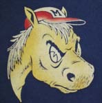
It wouldn't seem like such a big deal to people (including me) if our football team wasn't so stinking bad. For 16 years, our team has been crappy. But through all the bad times, at least we could say we have a cool logo. Now our logo and team match each other. Yay. The "running mustang" was our only symbolic link to the successful past. Especially now that our unis look like Ole Miss. So when you take that link away, or give it a back seat, a lot of people are going to freak out.
I think PK's point is valid. If we were averaging 9 wins a year, nobody would think of trying to change the logo. It wouldn't even occur to them. Do they think changing the logo will help us win? I don't get it.
I think PK's point is valid. If we were averaging 9 wins a year, nobody would think of trying to change the logo. It wouldn't even occur to them. Do they think changing the logo will help us win? I don't get it.
-
KnuckleStang - Posts: 2605
- Joined: Tue Dec 10, 2002 4:01 am
- Location: Lynchburg, VA, USA
![]() by Bergermeister » Wed Jul 13, 2005 8:28 am
by Bergermeister » Wed Jul 13, 2005 8:28 am
Those voicing their opinions regarding the "addition" of this new stuff are probably not so opposed to the infusion of new material as they are the quality of what is being touted. The designs are crummy. Blase. The question is, "Why change to something of lesser quality?" If it was better than what we've already got, the reaction might be different. Looks like somebody wants to change for the sake of change. Imperator is just a little too obvious as a plant. I nominate Mr. Mustang to appoint a Blue Ribbon Focus Group to develop a Master Plan to combat fake focus groups that result in spending a lot of money for ad art logos. I, too, would like to see some of the ideas for the new UT logos. Are they out yet?
-
Bergermeister - Posts: 7132
- Joined: Sun Jul 28, 2002 3:01 am
- Location: University Park
![]() by CalallenStang » Wed Jul 13, 2005 8:32 am
by CalallenStang » Wed Jul 13, 2005 8:32 am
Thank you Bergermeister. The fact of the matter is, the new logo STINKS. Plus, it looks like Boise State. If they want to give us a new identity, let's get our own original identity rather than taking someone else's.
-
CalallenStang - Posts: 19359
- Joined: Thu Jun 23, 2005 9:43 pm
- Location: 25 feet from the Hillcrest track
![]() by LakeHighlandsPony » Wed Jul 13, 2005 8:45 am
by LakeHighlandsPony » Wed Jul 13, 2005 8:45 am
CalallenStang wrote:Thank you Bergermeister. The fact of the matter is, the new logo STINKS. Plus, it looks like Boise State. If they want to give us a new identity, let's get our own original identity rather than taking someone else's.
AGREED- Bring back the Pony Express Uniforms and dump the Ole Miss/NY Football Giants replicas!
-
LakeHighlandsPony - Posts: 2558
- Joined: Fri Nov 05, 2004 8:50 am
- Location: The Boneyard
Who is online
Users browsing this forum: No registered users and 3 guests