|
PonyFans.com •
Board Index •
Around the Hilltop •
Football •
Recruiting •
Basketball •
Other Sports
This is the forum for talk about SMU Football
Moderators: PonyPride, SmooPower
 by PK » Tue Jan 05, 2010 2:54 pm by PK » Tue Jan 05, 2010 2:54 pm
Stallion wrote:I could care less if it was Harvard Red or Yale Blue as long as they looked good on HDTV. Like the contrast between the Michigan Blue and Yellow or the USC Scarlet and Yellow. It ALL starts with the uniforms.
 Crimson would look great on HDTV...and in person too. Next time you are at the stadium and they have the SMU flag flying in the southeast corner you will see what I mean...it's close to the correct colors. SMU's first president, Robert S. Hyer, selected Harvard Crimson and Yale Blue as SMU's colors to symbolize SMU's high academic standards. We are one of the few Universities to have school colors with real meaning...and we just blow them off.
-

PK
 -
- Posts: 8805
- Joined: Wed Sep 06, 2000 3:01 am
- Location: Dallas, Texas 75206
by NavyCrimson » Tue Jan 05, 2010 3:16 pm
Absolutely!!!
Stallion is probably color blind anyway. LOL!
But I agree, go back to the school colors & they'll look SHARP!!!
REAL SHARP!!! Our colors contrast well, same hue, & on HD, they'll look good!!!
Until we go back to our school colors, we'll be arguing about this till the Second Coming!
Last edited by NavyCrimson on Tue Jan 05, 2010 3:21 pm, edited 2 times in total.
BRING BACK THE GLORY DAYS OF SMU FOOTBALL!!!
For some strange reason, one of the few universities that REFUSE to use their school colors: Harvard Crimson & Yale Blue.
-

NavyCrimson
-
- Posts: 3164
- Joined: Wed Sep 13, 2000 3:01 am
- Location: Simi Valley-CA (Hm of the Ronald Reagan Presidential Library)
by 1983 Cotton Bowl » Tue Jan 05, 2010 3:17 pm
Why did we ditch the blue jerseys this season? I prefer them to the red ones. Did the players have a vote or something?
-
1983 Cotton Bowl
 -
- Posts: 1745
- Joined: Mon Oct 27, 2008 2:17 pm
- Location: Charlotte, North Carolina
by Bergermeister » Tue Jan 05, 2010 3:29 pm
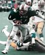
The CURRENT colors are outstanding (we all know they change without notice). All white is the best look. The red jerseys and blue jerseys both look classy, though.
-
Bergermeister
-
- Posts: 7132
- Joined: Sun Jul 28, 2002 3:01 am
- Location: University Park
by couch 'em » Tue Jan 05, 2010 4:37 pm
Let's go with Blue front and Red back at home.
"I think Couchem is right."
-EVERYONE
-

couch 'em
-
- Posts: 9758
- Joined: Wed Sep 04, 2002 3:01 am
- Location: Farmers Branch
by DanFreibergerForHeisman » Tue Jan 05, 2010 4:58 pm
Not that this hasn't been discussed ad nauseum, but...
Yale Blue is somewhere between royal and navy so we have never actually worn Yale blue so you can't talk about going back to it. It's actually more royal than navy anyway. The blue jerseys we have now are a lot closer than the navy ones we used to have.
Harvard Red is reasonably close to the red we wear now. It's certainly more red than the crimson Alabama or Oklahoma wear, although the red jerseys are probably a bit too bright. Red is best left as a trim color anyway.
BTW, we're not the only team that doesn't wear our school colors. There are TONS of them. As a matter of fact, the official colors of Ole Miss are also Harvard Red and Yale Blue and they wear way too dark of a blue.
Of course, no matter what you think about our blues, tcu still looked like total crap last night.
Shake It Off Moody
-

DanFreibergerForHeisman
-
- Posts: 16485
- Joined: Mon Jul 24, 2000 3:01 am
-
by DanFreibergerForHeisman » Tue Jan 05, 2010 5:03 pm
Oh - and one more thing - if you research the history of Yale Blue you learn it has changed significantly over the years - varying between lighter and darker versions of the current Yale Blue accepted and documented by current modern technology (Pantone, hex color, etc.)
If you really wanted SMU to be historically accurate, it would be necessary to determine the exact Yale Blue in 1917 or whenever the colors were officially adopted by the university which would be next to impossible.
You certainly can't take PMS 289 and say that's the color SMU should wear today.
Shake It Off Moody
-
DanFreibergerForHeisman
-
- Posts: 16485
- Joined: Mon Jul 24, 2000 3:01 am
-
by ozfan » Tue Jan 05, 2010 5:18 pm
Stallion wrote:the one thing TCU has going for it is several years ago they finally discovered a unique deep hue strong purple color that looks good on HDTV. SMU is the same old boring red on red just like 50 other Division 1A teams. BORING. SMU Red is not even a strong red like say Alabama or USC or Arkansas. Its a pansy [deleted] boring red that is blah blah blah on HDTV. SMU should find the right deep hue strong blue color and contrast with the Red Pony-oh yeah they already had that color before we screwed it up.
Why don't we try the true school colours(colors)..... Sent from my KOREAN knockoff using Tapdance 5
-
ozfan
 -
- Posts: 854
- Joined: Wed Jun 18, 2008 9:43 pm
- Location: Melbourne Australia
by PK » Tue Jan 05, 2010 5:27 pm
DanFreibergerForHeisman wrote:Oh - and one more thing - if you research the history of Yale Blue you learn it has changed significantly over the years - varying between lighter and darker versions of the current Yale Blue accepted and documented by current modern technology (Pantone, hex color, etc.)
If you really wanted SMU to be historically accurate, it would be necessary to determine the exact Yale Blue in 1917 or whenever the colors were officially adopted by the university which would be next to impossible.
You certainly can't take PMS 289 and say that's the color SMU should wear today.
It is also hard to compare clothing dyes to Pantone colors. Someone said a number of years back that the original Yale Blue dye was no longer available commercially...whatever that means...which is why we used the Navy blue during the PB era. How about a link to that Yale blue history. SMU's first president, Robert S. Hyer, selected Harvard Crimson and Yale Blue as SMU's colors to symbolize SMU's high academic standards. We are one of the few Universities to have school colors with real meaning...and we just blow them off.
-
PK
-
- Posts: 8805
- Joined: Wed Sep 06, 2000 3:01 am
- Location: Dallas, Texas 75206
by Mestengo » Tue Jan 05, 2010 5:29 pm
[quote="mr. pony"]I sorta liked TCU's marble looking helmets with the bold white letters.
Yeah so did I.
-

Mestengo
-
- Posts: 3668
- Joined: Sat Oct 10, 2009 9:39 am
by DanFreibergerForHeisman » Tue Jan 05, 2010 5:49 pm
PK wrote:DanFreibergerForHeisman wrote:Oh - and one more thing - if you research the history of Yale Blue you learn it has changed significantly over the years - varying between lighter and darker versions of the current Yale Blue accepted and documented by current modern technology (Pantone, hex color, etc.)
If you really wanted SMU to be historically accurate, it would be necessary to determine the exact Yale Blue in 1917 or whenever the colors were officially adopted by the university which would be next to impossible.
You certainly can't take PMS 289 and say that's the color SMU should wear today.
It is also hard to compare clothing dyes to Pantone colors. Someone said a number of years back that the original Yale Blue dye was no longer available commercially...whatever that means...which is why we used the Navy blue during the PB era. How about a link to that Yale blue history.
It's also hard to compare color swatches online to jerseys since jerseys are shiny and color swatches are flat. I researched Yale Blue a couple of years ago, I'll see what I can dig up. In all honesty, I imagine the "proper" color would be about half way between navy and royal, making it almost impossible to wear the "proper" color until we are big time enough to have adidas, Nike, or god-forbid Under Armour manufacture uniform fabric specifically for us. They certainly could do it if they wanted to. Obviously, the success and familiarity of the 80s SMU teams causes many to be biased to the royal look, but the navy look was likely doomed from day one because of the helmets. It would be interesting if the navy look would have been as universally hated as it was if they would have gone with white helmets. Shake It Off Moody
-
DanFreibergerForHeisman
-
- Posts: 16485
- Joined: Mon Jul 24, 2000 3:01 am
-
by LakeHighlandsPony » Tue Jan 05, 2010 5:54 pm
Can we kill the black socks and black shoes?? That is 90's Miami thug look and needs to go.
-
LakeHighlandsPony
 -
- Posts: 2558
- Joined: Fri Nov 05, 2004 8:50 am
- Location: The Boneyard
by soccermom » Tue Jan 05, 2010 6:03 pm
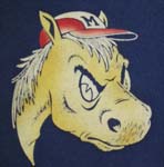
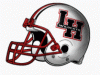
TCU's uniforms are a pitiful joke----yuck!!! I think the helmets were just as bad as the pants/shirts. When I first saw the helmet from the front, I wondered why someone hadn't dusted them off before the players put them on and then when I saw the back/side views I realized they were suppose to look like that. Don't understand the red stripe on the helmet, either. Someone was flying high when they came up with this design!!!
-

soccermom
-
- Posts: 3357
- Joined: Sat Nov 07, 2009 9:48 am
- Location: League City, Tx
by DanFreibergerForHeisman » Tue Jan 05, 2010 6:06 pm
soccermom wrote:TCU's uniforms are a pitiful joke----yuck!!! I think the helmets were just as bad as the pants/shirts. When I first saw the helmet from the front, I wondered why someone hadn't dusted them off before the players put them on and then when I saw the back/side views I realized they were suppose to look like that. Don't understand the red stripe on the helmet, either. Someone was flying high when they came up with this design!!!
The red stripes represent veins carrying blood to the eyeballs since horned lizards shoot blood out of their eyes at their predators when cornered. Granted, shooting blood out of the eyes is probably pretty cool, but I don't know why you would advertise the fact your mascot can get cornered. Shake It Off Moody
-
DanFreibergerForHeisman
-
- Posts: 16485
- Joined: Mon Jul 24, 2000 3:01 am
-
by NavyCrimson » Tue Jan 05, 2010 6:31 pm
Dan...: "...but the navy look was likely doomed from day one because of the helmets. It would be interesting if the navy look would have been as universally hated as it was if they would have gone with white helmets."
I agree with your comment on "navy". The navy really got a bad rap & I think this is due to our perpetual losing during this time frame. Otherwise, the navy or Yale Blue really looks good with crimson (dark red) helmets. Why they let PB go with a blue helmet is beyond me & I'm sure others? But then again, the administrators are there for their paycheck & well, you know the rest of the story. PK says its best here. He's far more eloquent than I can ever be. The administrators should have had the forsight to see the backlash. Remember the 60's look? Smashing & if they were darker shades of the red & blue, even better!!! SMU never had blue helmets & no one could relate to them. Besides, they just looked blaaa. The pants & jerseys were great, sharp, crisp, & strong looking. Darker colors just look good. As for our helmets, they have always been red or dark red (crimson) or the white during the Meredith years & 80's & early 90's. I'm with PK, back to the school colors or at least have a retro uni & helmet like many schools are providing. What better way to honor the men who put Mustang football on the map in the first place. Lake...: "...Can we kill the black socks and black shoes?? That is 90's Miami thug look and needs to go."
Right you are!!! If This hasn't been posted yet, here are the Frogs unis: http://www.examiner.com/x-24598-TCU-Hor ... ms-vs-UtahLast edited by NavyCrimson on Tue Jan 05, 2010 6:47 pm, edited 3 times in total.
BRING BACK THE GLORY DAYS OF SMU FOOTBALL!!!
For some strange reason, one of the few universities that REFUSE to use their school colors: Harvard Crimson & Yale Blue.
-
NavyCrimson
-
- Posts: 3164
- Joined: Wed Sep 13, 2000 3:01 am
- Location: Simi Valley-CA (Hm of the Ronald Reagan Presidential Library)
Return to Football
Who is online
Users browsing this forum: Google [Bot] and 11 guests
|
|