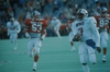
I don't think I like the shoulder horizontal stripes...
On TV they may look ok, but in real life, at the stadium, the red pinstripe is playing games around the blue stripes between the white stripes....
Sort of like the way the Red Pony had problems on the Blue helmet before they wrapped it in silver, or one of those bikers who puts that blue dot on a tail light makes it look purple-ish. Up close, in that case, you see red and blue, but it looks purple at a distance.
Plus, the horizontal shoulder stripe is goofy...it just looks off.
This will need to be addressed next year.
UNIFORM WATCH
Moderators: PonyPride, SmooPower
25 posts
• Page 1 of 2 • 1, 2
![]() by J.T.supporta » Fri Sep 12, 2008 6:32 pm
by J.T.supporta » Fri Sep 12, 2008 6:32 pm
lets make it to a bowl game then these "issues" can be addressed
-

J.T.supporta 
- Posts: 6160
- Joined: Thu Apr 06, 2006 12:27 pm
- Location: SMU
Re: UNIFORM WATCH
![]() by expony18 » Fri Sep 12, 2008 6:33 pm
by expony18 » Fri Sep 12, 2008 6:33 pm
PhirePhilBennett wrote:Plus, the horizontal shoulder stripe is goofy....


WEST DIVISION CHAMPS 2010
- expony18
- Posts: 9968
- Joined: Thu Dec 08, 2005 2:54 pm

![]() by TheBestAvailable » Fri Sep 12, 2008 8:49 pm
by TheBestAvailable » Fri Sep 12, 2008 8:49 pm
The problem isn't just the fact that there are too many stripes or that it's basically a Buffalo Bills Jersey with SMU on the chest. The problem is that the stripes don't fit into the overall scheme of the pants or the helmets.
If you look at the FLorida/Ohio State stripes you will notice that the color scheme and number of stripes on the sleeve match the pants/helmet.
The center stripe (on the helmet, Pants and Jersey)is white, with a blue stripe on both sides and the blue stripes are between two orange stripes. If you notice this color scheme is continued on both the pant and the jersey.
The Orange stripes on the pants and jerseys represent the orange helmet. There was some thought put into this.
Of course the orange stripes on the pants are wider than the orange stripes on the jerseys but they match the scheme.
[/quote]
Ohio State's stripes fit into the color scheme between the pants, helmet and jersey.
As far as Texas , they wore two stripes down the side of their pants in the past and two stripes on the sleeve. I had a brother on their team when they wore that uni. It means something and ours don't.
Can't Adidas just reproduce one of the uniforms from the winning years in the 80's. How hard would it be to get that correct? Also the the stipes on these helmets were worn post dp by a lot of losing teams.
Most programs copy a winning uni. I know the uni's don't ultimately affect wins/losses but it bothers the he77 out of me.
-
TheBestAvailable 
- Posts: 628
- Joined: Tue Dec 11, 2007 11:09 pm
- Location: Downtown Dallas
![]() by J.T.supporta » Fri Sep 12, 2008 8:51 pm
by J.T.supporta » Fri Sep 12, 2008 8:51 pm
just think if we were/went to Oregon. we could complain all day about the jerseys
-
J.T.supporta - Posts: 6160
- Joined: Thu Apr 06, 2006 12:27 pm
- Location: SMU
![]() by TheBestAvailable » Fri Sep 12, 2008 9:05 pm
by TheBestAvailable » Fri Sep 12, 2008 9:05 pm
The big time traditional powerhouse programs have a uniform that's easily identified as theirs.
USC, Michigan, Ohio State, Florida, Tennessee, Alabama, Georgia, etc. If you see their uniform you know it's theirs and not some other team on another sports level.
We need to establish that and stick with it going forward.
These new uniforms are like the girl you start dating and you try reeeeeeeeeeeally hard to like her. Other people tell you she's okay but in your heart you know that something just isn't right.
-
TheBestAvailable - Posts: 628
- Joined: Tue Dec 11, 2007 11:09 pm
- Location: Downtown Dallas
![]() by expony18 » Fri Sep 12, 2008 9:08 pm
by expony18 » Fri Sep 12, 2008 9:08 pm

side note: all of the schools you have mentioned modify their uniform look from year to year, they may only be slight changes on a yearly basis but over time they are very noticeable. question what did the first ohio state, michigan, and smu jerseys look like?
WEST DIVISION CHAMPS 2010
- expony18
- Posts: 9968
- Joined: Thu Dec 08, 2005 2:54 pm
![]() by TheBestAvailable » Fri Sep 12, 2008 9:15 pm
by TheBestAvailable » Fri Sep 12, 2008 9:15 pm
We can argue about this all day but the fact of the matter is that we wear a Buffalo Bill's jersey. It S#cks! Just like the Red NY jet style uni Cavan tried. They need to go away.
-
TheBestAvailable - Posts: 628
- Joined: Tue Dec 11, 2007 11:09 pm
- Location: Downtown Dallas
![]() by NavyCrimson » Fri Sep 12, 2008 10:19 pm
by NavyCrimson » Fri Sep 12, 2008 10:19 pm
These new uniforms are like the girl you start dating and you try reeeeeeeeeeeally hard to like her. Other people tell you she's okay but in your heart you know that something just isn't right.
Well said - TheBestAvailable
BRING BACK THE GLORY DAYS OF SMU FOOTBALL!!!
For some strange reason, one of the few universities that REFUSE to use their school colors: Harvard Crimson & Yale Blue.
For some strange reason, one of the few universities that REFUSE to use their school colors: Harvard Crimson & Yale Blue.
-

NavyCrimson - Posts: 3163
- Joined: Wed Sep 13, 2000 3:01 am
- Location: Simi Valley-CA (Hm of the Ronald Reagan Presidential Library)
25 posts
• Page 1 of 2 • 1, 2
Who is online
Users browsing this forum: No registered users and 4 guests