looks great IMHO
http://collegespun.com/homepage/photo-check-out-the-patch-that-the-american-athletic-conference-teams-will-wear-in-2013#
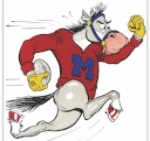
"American" uniform patch pic
Moderators: PonyPride, SmooPower
19 posts
• Page 1 of 2 • 1, 2
"American" uniform patch pic
![]() by ponyinNC » Thu Jun 27, 2013 4:38 pm
by ponyinNC » Thu Jun 27, 2013 4:38 pm
-

ponyinNC 
- Posts: 4974
- Joined: Fri Dec 29, 2006 8:55 am
- Location: Wrightsville Beach, N.C.
Re: "American" uniform patch pic
![]() by Mustangsabu » Thu Jun 27, 2013 5:22 pm
by Mustangsabu » Thu Jun 27, 2013 5:22 pm
That's great.
Mustangs Abu!
-

Mustangsabu - Posts: 4438
- Joined: Mon Sep 03, 2007 12:34 pm
- Location: Dallas, TX
Re: "American" uniform patch pic
![]() by stc9 » Thu Jun 27, 2013 9:20 pm
by stc9 » Thu Jun 27, 2013 9:20 pm
Like it
Some rise by sin, and some by virtue fall
- stc9

- Posts: 1157
- Joined: Mon Jun 14, 2010 7:37 am
- Location: Jax Beach, FL
Re: "American" uniform patch pic
![]() by Bergermeister » Fri Jun 28, 2013 8:03 am
by Bergermeister » Fri Jun 28, 2013 8:03 am
Sculpted into Ford Stadium turf yet?
-
Bergermeister - Posts: 7132
- Joined: Sun Jul 28, 2002 3:01 am
- Location: University Park
Re: "American" uniform patch pic
![]() by JoeKidd » Sun Jun 30, 2013 6:20 am
by JoeKidd » Sun Jun 30, 2013 6:20 am
Pretty solid, like it better than most other conference patches.
#Beat Clemson
-

JoeKidd - Posts: 1698
- Joined: Wed Nov 02, 2011 7:41 am
Re: "American" uniform patch pic
![]() by PSCA » Mon Jul 01, 2013 12:19 pm
by PSCA » Mon Jul 01, 2013 12:19 pm
It has a clean look to it. Unless the school has changed theirs ... it sort of looks like the Logo for the University of Arizona (unless UA has changed).
- PSCA

- Posts: 672
- Joined: Thu May 31, 2012 2:19 pm
Re: "American" uniform patch pic
![]() by blackoutpony » Mon Jul 01, 2013 12:31 pm
by blackoutpony » Mon Jul 01, 2013 12:31 pm
PSCA wrote:It has a clean look to it. Unless the school has changed theirs ... it sort of looks like the Logo for the University of Arizona (unless UA has changed).
It looks like the Arizona logo is drinking a Heineken
BOP - Providing insensitivity training for a politically correct world since 1989.
-

blackoutpony - Posts: 4135
- Joined: Wed Mar 13, 2013 1:12 pm
- Location: The Tomb of Ken Pye
Re: "American" uniform patch pic
![]() by BigT3x » Mon Jul 01, 2013 1:26 pm
by BigT3x » Mon Jul 01, 2013 1:26 pm
Can anyone explain to me why the star looks like that? If they would remove the star's erection, the logo would improve.
It's awful with or without the badly drawn star, but it would at least be a start.
It's awful with or without the badly drawn star, but it would at least be a start.
- BigT3x
- Posts: 828
- Joined: Mon Nov 21, 2011 9:59 pm
Re: "American" uniform patch pic
![]() by lwjr » Tue Jul 02, 2013 11:43 am
by lwjr » Tue Jul 02, 2013 11:43 am
Reminds me of the NFL's AFC logo.
GO MUSTANGS!
- lwjr
- Posts: 8160
- Joined: Wed Jul 11, 2007 9:37 pm
- Location: Midland, Texas
Re: "American" uniform patch pic
![]() by East Coast Mustang » Tue Jul 02, 2013 11:51 am
by East Coast Mustang » Tue Jul 02, 2013 11:51 am
Hopefully this isn't the only change to our uniforms this season.
2005 PonyFans.com Rookie of the Year Award Recipient
-

East Coast Mustang - Posts: 7432
- Joined: Sat May 21, 2005 8:35 am
Re: "American" uniform patch pic
![]() by StallionsModelT » Tue Jul 02, 2013 12:10 pm
by StallionsModelT » Tue Jul 02, 2013 12:10 pm
Yeah lets ignore the only period of SMU badassery (80's Pony Express) and the iconic blue uniforms with the oversized SMU on it. That would be too smart.
Back off Warchild seriously.
- StallionsModelT
- Posts: 7800
- Joined: Wed Nov 21, 2007 2:46 pm
- Location: Dallas, Texas
Re: "American" uniform patch pic
![]() by BIGHORSE » Tue Jul 02, 2013 12:29 pm
by BIGHORSE » Tue Jul 02, 2013 12:29 pm
The new uniform patch uses both of the colors we used to use, now we only
use one color, I know J.J. likes the red only, but even baylor and tech can find a way
to use both of their colors.
use one color, I know J.J. likes the red only, but even baylor and tech can find a way
to use both of their colors.
-

BIGHORSE 
- Posts: 2881
- Joined: Mon Oct 04, 2004 7:49 pm
Re: "American" uniform patch pic
![]() by ponyboy » Tue Jul 02, 2013 12:38 pm
by ponyboy » Tue Jul 02, 2013 12:38 pm
I'm amazed anyone cares what frigging fashion we're trotting out there. Knock someone's head off and don't worry about your outfit. What a bunch of fairies.
- ponyboy
- Posts: 15134
- Joined: Wed Mar 22, 2000 4:01 am
- Location: University Park,TX US
Re: "American" uniform patch pic
![]() by BIGHORSE » Tue Jul 02, 2013 1:27 pm
by BIGHORSE » Tue Jul 02, 2013 1:27 pm
ponyboy wrote:I'm amazed anyone cares what frigging fashion we're trotting out there. Knock someone's head off and don't worry about your outfit. What a bunch of fairies.
We want them to knock someone's head off also, we want to look as cool as possible
doing it, so there you go queen fairy!!!
-
BIGHORSE - Posts: 2881
- Joined: Mon Oct 04, 2004 7:49 pm
19 posts
• Page 1 of 2 • 1, 2
Who is online
Users browsing this forum: Google [Bot] and 5 guests