http://m.espn.go.com/ncf/story?storyId=11005374
Long article, some of which is true, other parts witty and parts informative. What I got out of it:
"3. A man's got to know his limitations
Leonardo da Vinci didn't paint an alternate version of "Mona Lisa" with a frown. Vermeer didn't paint "Girl With a Diamond Earring." Grant Wood's "American Gothic" doesn't feature the farmer holding a saxophone. Some things you don't mess with, like certain football unis. Alternate jersey and helmet logos are fine. Sometimes they're even better than the primary outfits. But under no circumstances -- the penalty being the offender has to do the Oklahoma drill, against actual OU players -- should the following programs ever change their helmet logos: Oklahoma, USC, Alabama, Tennessee, Georgia, SMU, Michigan, Ohio State, Penn State, Wisconsin, Texas, TCU, Fresno State, Colorado and Notre Dame."
Amen (except for TCEww and FState). Never mess with the unwavering classics!
Yeah I don't know why I wrote TCEww, but it made me laugh.
Don't Change...The Helmet
Moderators: PonyPride, SmooPower
25 posts
• Page 1 of 2 • 1, 2
Don't Change...The Helmet
![]() by HarvCrimYaleBlue » Mon Jun 02, 2014 11:07 pm
by HarvCrimYaleBlue » Mon Jun 02, 2014 11:07 pm
-

HarvCrimYaleBlue 
- Posts: 1425
- Joined: Mon Dec 10, 2012 5:47 pm
Re: Don't Change...The Helmet
![]() by East Coast Mustang » Mon Jun 02, 2014 11:27 pm
by East Coast Mustang » Mon Jun 02, 2014 11:27 pm
Yea, there is nothing iconic or particularly appealing about TCU's helmets.
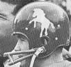
Ours is definitely a classic, though. The red pony on the white helmet should always remain.
Ours is definitely a classic, though. The red pony on the white helmet should always remain.
Last edited by East Coast Mustang on Mon Jun 02, 2014 11:29 pm, edited 1 time in total.
2005 PonyFans.com Rookie of the Year Award Recipient
-
East Coast Mustang 
- Posts: 7432
- Joined: Sat May 21, 2005 8:35 am
Re: Don't Change...The Helmet
![]() by gostangs » Mon Jun 02, 2014 11:28 pm
by gostangs » Mon Jun 02, 2014 11:28 pm
what so special about the TCU helmet. it is flat out ugly. And Fresno? bizarre
- gostangs
- Posts: 12315
- Joined: Mon Dec 02, 2002 4:01 am
- Location: Dallas, Texas USA
Re: Don't Change...The Helmet
![]() by BIGHORSE » Tue Jun 03, 2014 6:13 am
by BIGHORSE » Tue Jun 03, 2014 6:13 am
Please put the Pony Express stripes back on the helmet and pants.
-

BIGHORSE 
- Posts: 2881
- Joined: Mon Oct 04, 2004 7:49 pm
Re: Don't Change...The Helmet
![]() by ponyte » Tue Jun 03, 2014 9:49 am
by ponyte » Tue Jun 03, 2014 9:49 am
I'm glad they are changing the helmet to helmet rule. That was a pitiful call against us at the end of the Cinncy game. Not that it made a difference in the outcome, but it was pitiful that there was no violation but the penalty was enforced anyway.
-
ponyte - Posts: 11211
- Joined: Wed Jan 15, 2003 4:01 am
- Location: Nw Orleans, LA region
Re: Don't Change...The Helmet
![]() by CenTXpony » Tue Jun 03, 2014 10:47 am
by CenTXpony » Tue Jun 03, 2014 10:47 am
BIGHORSE wrote:Please put the Pony Express stripes back on the helmet and pants.
I want the separated stripes.
-

CenTXpony - Posts: 1961
- Joined: Fri Oct 14, 2011 11:19 am
- Location: Temple, TX
Re: Don't Change...The Helmet
![]() by ReedFrawg » Tue Jun 03, 2014 11:11 am
by ReedFrawg » Tue Jun 03, 2014 11:11 am
Who doesn't like a giant frog?
- ReedFrawg
- Posts: 1936
- Joined: Wed Feb 05, 2003 4:01 am
- Location: Fort Worth, TX, US
Re: Don't Change...The Helmet
![]() by mrydel » Tue Jun 03, 2014 11:22 am
by mrydel » Tue Jun 03, 2014 11:22 am
Flys
All those who believe in psycho kinesis, raise my hand
-

mrydel - Posts: 32035
- Joined: Sat Feb 01, 2003 4:01 am
- Location: Sherwood,AR,USA
Re: Don't Change...The Helmet
![]() by ReedFrawg » Tue Jun 03, 2014 11:42 am
by ReedFrawg » Tue Jun 03, 2014 11:42 am
mrydel wrote:Flys
well played sir...well played
- ReedFrawg
- Posts: 1936
- Joined: Wed Feb 05, 2003 4:01 am
- Location: Fort Worth, TX, US
Re: Don't Change...The Helmet
![]() by East Coast Mustang » Tue Jun 03, 2014 12:30 pm
by East Coast Mustang » Tue Jun 03, 2014 12:30 pm
BIGHORSE wrote:Please put the Pony Express stripes back on the helmet and pants.
Totally agree about the pants; however, I think the stripes currently on the helmet that we all hate more closely resemble the stripes on the helmet during the Pony Express era. I, however, still prefer the wider, separated stripes from a few years back

2005 PonyFans.com Rookie of the Year Award Recipient
-
East Coast Mustang - Posts: 7432
- Joined: Sat May 21, 2005 8:35 am
Re: Don't Change...The Helmet
![]() by Bergermeister » Tue Jun 03, 2014 12:59 pm
by Bergermeister » Tue Jun 03, 2014 12:59 pm
Pony was too small in 2013.
-
Bergermeister - Posts: 7132
- Joined: Sun Jul 28, 2002 3:01 am
- Location: University Park
Re: Don't Change...The Helmet
![]() by BIGHORSE » Tue Jun 03, 2014 1:36 pm
by BIGHORSE » Tue Jun 03, 2014 1:36 pm
CenTXpony wrote:BIGHORSE wrote:Please put the Pony Express stripes back on the helmet and pants.
I want the separated stripes.
The separated stripes work for me too.
-
BIGHORSE - Posts: 2881
- Joined: Mon Oct 04, 2004 7:49 pm
Re: Don't Change...The Helmet
![]() by SMU1523 » Tue Jun 03, 2014 1:55 pm
by SMU1523 » Tue Jun 03, 2014 1:55 pm
Bergermeister wrote:Pony was too small in 2013.
I wasn't for sure if the pony was smaller, or if it was an illusion due to the stripes being more narrow. So, I decided to do a quick test with Photoshop. It appears, IMO that the helmet decal was significantly smaller in 2013. On the blended image I resized the images to scale correctly (using the face mask attachment as a guide).

Please SMU, stop tweaking things that do not need to be tweaked for no reason... Classic is classic because it never changes!
-
SMU1523 - Posts: 1350
- Joined: Tue Oct 12, 2010 9:03 pm
- Location: Dallas, TX
Re: Don't Change...The Helmet
![]() by Big12Mustang » Tue Jun 03, 2014 2:51 pm
by Big12Mustang » Tue Jun 03, 2014 2:51 pm
SMU1523 wrote:Bergermeister wrote:Pony was too small in 2013.
I wasn't for sure if the pony was smaller, or if it was an illusion due to the stripes being more narrow. So, I decided to do a quick test with Photoshop. It appears, IMO that the helmet decal was significantly smaller in 2013. On the blended image I resized the images to scale correctly (using the face mask attachment as a guide).
Please SMU, stop tweaking things that do not need to be tweaked for no reason... Classic is classic because it never changes!
The bigger pony looks better. Just go with the official athletic logo for the helmet:
-
Big12Mustang - Posts: 2224
- Joined: Sun Jan 05, 2014 12:41 am
- Location: Uptown Dallas, TX
Re: Don't Change...The Helmet
![]() by East Coast Mustang » Tue Jun 03, 2014 2:55 pm
by East Coast Mustang » Tue Jun 03, 2014 2:55 pm
Interesting, 1523. I didn't realize how much smaller the pony actually was until you posted that. And yes, the larger one looks significantly better. I wonder if the smaller logo is a result of the new helmets that are oddly shaped on top and may make putting a larger decal on there more difficult?
And nice of Big12 to drop in with another idiotic idea.
And nice of Big12 to drop in with another idiotic idea.
2005 PonyFans.com Rookie of the Year Award Recipient
-
East Coast Mustang - Posts: 7432
- Joined: Sat May 21, 2005 8:35 am
25 posts
• Page 1 of 2 • 1, 2
Who is online
Users browsing this forum: No registered users and 15 guests