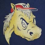
Can someone bring me up to speed on the font in which "SMU" is stenciled in the lanes and "Mustangs" is on the endlines at Moody? I may be wrong, but I swear it's the same font we've seen the last ohhh 12 years or so. I see SMU has taken the time to paint the CUSA logo, but didn't we hear a big to-do about the SMU brand, the appropriate stenciling, what constitutes SMU logos and what doesn't last fall? Forgive me for nitpicking, but if they want the new "SMU" with the dropped S to work, it needs to be universal...like in the lane at Moody, and Mustangs needs to look like it looks on the branding/identity page posted this fall.
I emailed Mr. Copeland about this issue when bball season started. His response is as follows:
.
A non-issue, I suppose.
Moody
Moderators: PonyPride, SmooPower
8 posts
• Page 1 of 1

![]() by Bergermeister » Tue Dec 20, 2005 9:20 am
by Bergermeister » Tue Dec 20, 2005 9:20 am
I like the nice color contrast between the new C-USA logos and the existing court artwork painted when Matty Bell was athletic director. The huge build-up of varnish kinda makes one want to adopt "parchment yellow" as a third school color.
Somebody does need to get off their [deleted] and fix the American and Texas flags "displayed" in the rafters. Pitiful.
Somebody does need to get off their [deleted] and fix the American and Texas flags "displayed" in the rafters. Pitiful.
-
Bergermeister 
- Posts: 7132
- Joined: Sun Jul 28, 2002 3:01 am
- Location: University Park
![]() by Bergermeister » Tue Dec 20, 2005 9:20 am
by Bergermeister » Tue Dec 20, 2005 9:20 am
I like the nice color contrast between the new C-USA logos and the existing court artwork painted when Matty Bell was athletic director. The huge build-up of varnish kinda makes one want to adopt "parchment yellow" as a third school color.
Somebody does need to get off their [deleted] and fix the American and Texas flags "displayed" in the rafters. Pitiful.
Somebody does need to get off their [deleted] and fix the American and Texas flags "displayed" in the rafters. Pitiful.
-
Bergermeister - Posts: 7132
- Joined: Sun Jul 28, 2002 3:01 am
- Location: University Park
Moody floor
![]() by FriscoPMG » Tue Dec 20, 2005 1:12 pm
by FriscoPMG » Tue Dec 20, 2005 1:12 pm
From what I understand, the floor cannot be repainted until a brand new floor is put in altogether...and we all know that takes money, which SMU can't seem to scrounge up when it comes to supporting basketball. The current floor is so old and has been sanded down so many times that one more sanding will expose the nail heads, therefore a new paint job on the current floor is impossible.
The new C-USA & Guaranty Bank logos are simply large patches applied to the floor so adding those are not a problem.
Bottom line is that a new floor is desperately needed, but I guess the Guaranty Bank money is going towards something else besdies the floor that it sponsors.
The new C-USA & Guaranty Bank logos are simply large patches applied to the floor so adding those are not a problem.
Bottom line is that a new floor is desperately needed, but I guess the Guaranty Bank money is going towards something else besdies the floor that it sponsors.
-
FriscoPMG 
- Posts: 769
- Joined: Sun Dec 18, 2005 4:59 am
![]() by PK » Tue Dec 20, 2005 1:40 pm
by PK » Tue Dec 20, 2005 1:40 pm
Don't mention it.RGV Pony wrote:PK:
Similarly nothing personal to you, but please be advised that I have considered your request to shut my "big yap," and I must respectfully deny same. Thank you for your input, however.
-

PK - Posts: 8805
- Joined: Wed Sep 06, 2000 3:01 am
- Location: Dallas, Texas 75206
![]() by ponyplayer » Tue Dec 20, 2005 3:16 pm
by ponyplayer » Tue Dec 20, 2005 3:16 pm
floor at Moody?
Salvation Army is looking for a few good bell ringers........
Salvation Army is looking for a few good bell ringers........
- ponyplayer
- Posts: 766
- Joined: Sat Sep 10, 2005 12:57 pm
- Location: Dallas, TX
8 posts
• Page 1 of 1
Who is online
Users browsing this forum: No registered users and 2 guests