Page 8 of 9
Posted: Mon Nov 26, 2007 9:23 pm
by Stallion
who allowed that moron to disgrace an SMU uniform like that? Oh I forgot Dave Smith was an Aggie-one of the original Junction boys-one of the ones Bear Bryant ran off.
Posted: Mon Nov 26, 2007 9:24 pm
by NavyCrimson
Like I suggested:
"But if college football is tradition, let's go back & see why Ron Meyer picked the white helmets. It was something that could only be traced back to a short time span of the late 50's. But why did he choose the white helmet. Was it heat? Was it something new? Was it clarity of the mustang logo - viewing it from afar? Remember that before Ron came, we had those hideous Dave Smith OSU helmets. Perhaps incorporate that into the tradition & why we're going back to the early 80's style. For the same reasons. You never know what the answer may be.
Now days, why not wear a retro uni & helmet like many colleges showcase on special occasions. But we'll do it a couple of times annually. Perhaps have a game or two a year with the 40's or 60's era & then we can satisfy all alums? Now that would be both interesting & great. In fact a new tradition. Much like the way the band works."
Posted: Mon Nov 26, 2007 9:24 pm
by Paladin
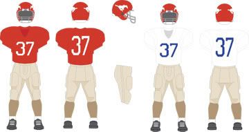
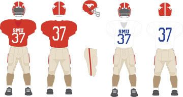
Topper wrote:OK. Lets settle this once and for all with a compromise: Dave Smith era. Silver helmets w/ red and blue stripe, red jerseys with untrimmed white letters and silver pants. Simple, Ohio Statish, classic.
Hands down, those were the worst uniforms an SMU team was ever outfitted in. I was terribly disappointed when I showed up in the freshman quad in '73 and saw the change from the previous years' unis..
Posted: Mon Nov 26, 2007 9:31 pm
by FWMustang
Posted: Mon Nov 26, 2007 9:32 pm
by ALEX LIFESON
NO FRIKIN' GOLD PANTS! PUT A RED FACEMASK ON THOSE WHITE HELMETS TOO!
Posted: Mon Nov 26, 2007 9:35 pm
by FWMustang
They are not gold. They are not shiny. think flat/matte like KU or NY Giants, but maize. Not Gold. Not Yellow. Red cages look like high school.
and stop yelling at me!
THe trick is to be unique, and not in an Oregon way.
Posted: Mon Nov 26, 2007 9:36 pm
by Stallion
Yes red facemasks too. Slight contrast of the red with the dominant blue adds to the look.
Posted: Mon Nov 26, 2007 9:37 pm
by QuikSStang
let's have the uni-guru design em:
www.uniwatchblog.com
Posted: Mon Nov 26, 2007 9:38 pm
by FWMustang
I would be for that. He HATES purple uniforms.
Posted: Mon Nov 26, 2007 9:44 pm
by NavyCrimson
"NO FRIKIN' GOLD PANTS!"
FW is correct. Actually their
khaki which is unique & no one else has them. These were very popular from the 20's through the 50's & they were a mainstay of our championship teams. Another reason to use them permanently or special occasions like retro stuff, etc.
Posted: Mon Nov 26, 2007 9:57 pm
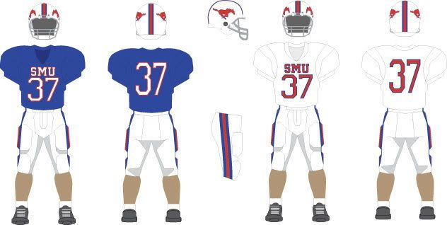
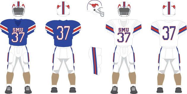
by PlanoStang
Go with the one of the top 2, but put a blue stripe down the pants of the
second level.
Posted: Mon Nov 26, 2007 11:30 pm
by PK
Hell...they are all good designs FWMustang, but I am torn choosing between the second from the top group and the third group. Both good clean classic college looks. Probably do need some blue on the home uniforms in the top two unis...maybe the stripe on the pants or helmet. BTW, stay away from the red face masks...to cheesy looking.
Posted: Mon Nov 26, 2007 11:42 pm
by PonyOLineFan
Third group is a nice change.
Posted: Mon Nov 26, 2007 11:52 pm
by Diamond Girl
Have y'all considered going on Project Runway? Not to see Heidi Klum, but as a designer.
Posted: Tue Nov 27, 2007 12:16 am
by PK
Upon further contemplation, designs 1 & 2 may be too Ivy League...looks kind of like Harvard (NTTAWWT)

Although, I do like the white jerseys with the khaki pant.

What would designs 3 & 4 look like with a blue that was a shade or two darker so it wouldn't look like Kansas Blue?