Page 2 of 9
Posted: Sat Nov 24, 2007 10:43 pm
by The Q
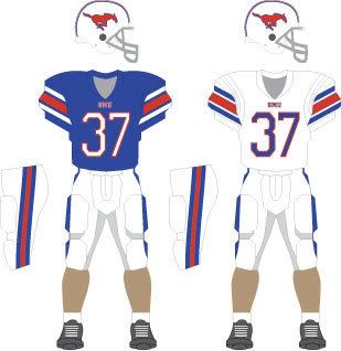
Stallion wrote:that picture makes those jerseies look a tad dark. It was overcast and wet in the Cotton Bowl when that picture was taken.
Which direction was the wind blowing? What was the barometric pressure?
Posted: Sat Nov 24, 2007 10:59 pm
by SMUer
Posted: Sat Nov 24, 2007 11:06 pm
by FWMustang
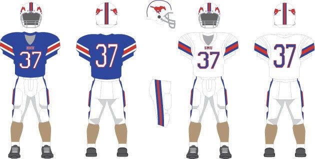
how about this?
Posted: Sat Nov 24, 2007 11:12 pm
by ALEX LIFESON
SMU needs to be bigger on the jersey.
Posted: Sat Nov 24, 2007 11:39 pm
by RGV Pony
I agree with all, including that the new "SMU blue" needs to be used, and that yes the cold wet Cotton Bowl made the jerseys look dark. The jackets that the band is wearing in the background is closer to the actual color.
Two other requests: THe helmet stripes need to be TOGETHER blueredblue, not apart like Arizona when they had white helmets. Also, a nice, diminuitive SMU on the front of the jersey, not the giant SMU like what was worn in Swan's years and in the New Mexico game at Ownby on youtube.
Posted: Sun Nov 25, 2007 12:40 am
by FWMustang
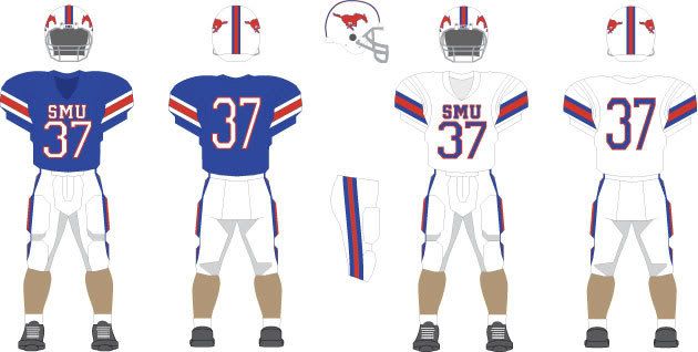
Okay, how about this? I took your suggestions.
Posted: Sun Nov 25, 2007 12:42 am
by Stallion
see the letters for Leach on the back-make SMU that big across the front immediately above the numbers
Posted: Sun Nov 25, 2007 12:45 am
by Treadway21
Glad to know SMU [deleted] up back then like they do now.
They did win the game to go undefeated so they didn't F up much else that day.
Posted: Sun Nov 25, 2007 12:48 am
by RE Tycoon
Treadway21 wrote:Glad to know SMU [deleted] up back then like they do now.
They did win the game to go undefeated so they didn't F up much else that day.
I was alluding to the presentation and not the actual teams. No reason to compare then and now on the field...
Posted: Sun Nov 25, 2007 12:49 am
by FWMustang
Well, I'm not a huge fan of being able to read the lettering on the front from space, but I'll indulge you.
Posted: Sun Nov 25, 2007 1:01 am
by Stallion
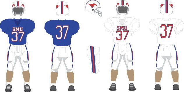
pretty close-now get rid of the piping on the sleaves
Posted: Sun Nov 25, 2007 1:10 am
by Treadway21
Agreed - Everything else looks spiffy. That look will return us to our winning ways.
Posted: Sun Nov 25, 2007 1:14 am
by Stallion
now put some great athletes in them and they will be ready for High Definition TV. BTW some of the worst looking uniforms on High Definition are Texas A&M-looks like mud. Deep Rich hues look great on High Definition especially when contrasted with a tad of red. I like generally SMU's road look with the scarlet red numerals. They look great on TV because red looks fine as a complementary color on white. What do you guys think we should wear on the road. I say Red Numerals not Blue. That's the way it was in the Pony Express days.
Posted: Sun Nov 25, 2007 1:22 am
by smitty329
If you really want tradition, let's go all the way back to - rowing?
The University’s first president, Robert S. Hyer, selected Harvard Red and Yale Blue as the school colors to symbolize SMU’s high standards.
http://www.news.harvard.edu/guide/lore/lore5.html
http://www.yale.edu/printer/identity/yaleblue.html
Posted: Sun Nov 25, 2007 1:26 am
by FWMustang
Last one tonight.
This is pretty much what they wore in the late 90's isn't it?

And have you seen this? It's an Adidas jersey.
