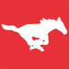
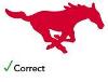
There are definitely two different running pony logos - I'm not sure about a third. Only one is authentic. It's the one used on the football helmet. Somehow over the years an alternate pony creeped into SMU's official merchandise. The alternate version has more of an "s" curve in the tail and larger hindquarters. A friend of mine has dubbed this the "fat-arse pony" -only he doesn't say "arse." The official pony is more streamlined (and just plain looks better).
To see what the "official" logo, colors and trademarks are, go here:
http://smumustangs.cstv.com/ot/smu-licensing.html
From what I can tell, SMU is making more of an effort to eliminate the fat-arse pony, but it's still out there on fairly new merchandise. Anything you see produced by specifically by SMU, including signage in Moody, Ford, etc., has the official, more streamlined pony. The one exception is in the Crum Center, where the fat-ass pony can been seen in some spots (whoever is responsible for this should be flogged!)
You can go to Lids at Northpark (which has a large selection of SMU caps, by the way) and see hats with both pony logos. Sometimes on the exact same style of hat! Hopefully this means word is spreading to manufacturers - and more importantly to whatever sources they rely on for logos and colors.