Page 3 of 11
NEW JERSEYS
Posted: Thu Jul 12, 2012 12:34 pm
by ponyboy
Vogue.com
Re: NEW JERSEYS
Posted: Thu Jul 12, 2012 12:47 pm
by Bergermeister
PonySnob wrote: Isn't that what all of the players want to wear?
We went that route with Cavan - bad decision.
Re: NEW JERSEYS
Posted: Thu Jul 12, 2012 2:12 pm
by Longtime
Note: According to this photo, the stripes will not be on the shoulder, aka "sleeves". These will run over the collarbone area. They are right next to the neck/collar area. This could be hideous. We will only know for sure once they are actually fitted on a player with shoulder pads.
There needs to be some blue detail with the big red stripes. They don't even match the two-color numerals. It's a mismatched look.
Re: NEW JERSEYS
Posted: Thu Jul 12, 2012 2:15 pm
by lwjr
JJ don't like no blue jerseys
Re: NEW JERSEYS
Posted: Thu Jul 12, 2012 3:15 pm
by PonySnob
lwjr wrote:JJ don't like no blue jerseys
JJ like black jerseys...........
Re: NEW JERSEYS
Posted: Thu Jul 12, 2012 3:50 pm
by Comet
lwjr wrote:JJ don't like no blue jerseys
JJ might not be here past a year though
Re: NEW JERSEYS
Posted: Thu Jul 12, 2012 3:52 pm
by fivemon
the numbers look very weird, they look alot like the Arizona numbers
Re: NEW JERSEYS
Posted: Thu Jul 12, 2012 4:06 pm
by TidePony
Texas A&M just unveiled their new Adidas football uniforms to the media. Harsh, is all I can say. The number font is hideous, the socks look like something a sixteen year old would wear on Halloween, and the stripe on the pants is strange. But, then again, what do expect from bunch of Aggies?
Re: NEW JERSEYS
Posted: Thu Jul 12, 2012 4:15 pm
by lwjr
TidePony wrote:Texas A&M just unveiled their new Adidas football uniforms to the media. Harsh, is all I can say. The number font is hideous, the socks look like something a sixteen year old would wear on Halloween, and the stripe on the pants is strange. But, then again, what do expect from bunch of Aggies?
I just looked at them and my first thought was, comical. But then again other than the schools that stick with the "traditional look", I think they are all starting to look comical.
Curious what Aggie response will be.
Re: NEW JERSEYS
Posted: Thu Jul 12, 2012 4:52 pm
by mustang1108
I'm not a fan of the numbers used by a&m in their new uniforms, but i don't think they are that bad. They are very similar to what they wore in the mid and late 70's.
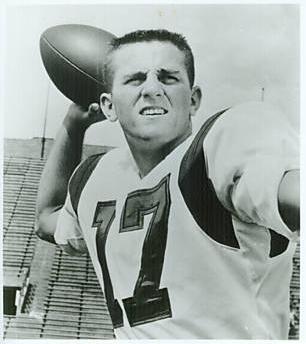
As for the new SMU jerseys I think it is pretty similar in that it has a retro feel with the shoulder stripes, but with a modern touch with our numbers as well. I think shoulder stripes would be a good look. In case you guys don't remember we had them in the Don Meredith days. However, I wish that there was more blue in them. I will be curious to see if we continue the same stripes on the helmet because with these jerseys it would look pretty tacky since the stripes would not match. Overall I am pretty pleased with what has been shown so far.
Re: NEW JERSEYS
Posted: Thu Jul 12, 2012 7:02 pm
by SMUer

Pseudo-retro
Re: NEW JERSEYS
Posted: Fri Jul 13, 2012 11:56 am
by CenTXpony
I edited the photo of the new jersey as to what I think would be a better look (just a simple color rendering), however I'm not able to post photos I guess or I do not know how? Any chance I could e-mail it to someone that could? I think the edited look is a pretty good look, just send me a PM.
Re: NEW JERSEYS
Posted: Fri Jul 13, 2012 12:03 pm
by Junesus
Black ones would be better

Re: NEW JERSEYS
Posted: Fri Jul 13, 2012 12:17 pm
by PonyKai
Junesus wrote:Black ones would be better

Just as long as they don't make the team look EXACTLY like Maryland from any distance over 20 feet away.
Re: NEW JERSEYS
Posted: Fri Jul 13, 2012 12:31 pm
by CenTXpony
Here's my edited version of the current jersey design.
https://www.facebook.com/#!/photo.php?f ... =1&theater
