Sorry to the uniform nazi, but this is my cross to bear on PonyFans.
Last year's uniforms sucked. The number font was terrible, the Nike check was black on the home uniforms (should have been blue), also the logo on the top middle that was the SMU Dallas Hall image should have been the Mustang logo instead. Furthermore, we need alternate BLUE away uniforms next year. It blows my mind how year in and year out our athletic department does such a [deleted] job with our uniforms- I realize a lot of it has to do with Nike and budgetary constraints but come on.
Next year we're going to be a national title contender- we need to look like one with some cool uniforms. Not some stupid spacesuits like Baylor wears, but something traditional and yet still eye-catching. This can be done. It needs to be done.
2014-15 uniform thread
Moderators: PonyPride, SmooPower
50 posts
• Page 1 of 4 • 1, 2, 3, 4
2014-15 uniform thread
![]() by East Coast Mustang » Wed May 07, 2014 11:54 am
by East Coast Mustang » Wed May 07, 2014 11:54 am
2005 PonyFans.com Rookie of the Year Award Recipient
-
East Coast Mustang 
- Posts: 7433
- Joined: Sat May 21, 2005 8:35 am
Re: 2014-15 uniform thread
![]() by malachi896 » Wed May 07, 2014 12:09 pm
by malachi896 » Wed May 07, 2014 12:09 pm
East Coast Mustang wrote:Sorry to the uniform nazi, but this is my cross to bear on PonyFans.
Last year's uniforms sucked. The number font was terrible, the Nike check was black on the home uniforms (should have been blue), also the logo on the top middle that was the SMU Dallas Hall image should have been the Mustang logo instead. Furthermore, we need alternate BLUE away uniforms next year. It blows my mind how year in and year out our athletic department does such a [deleted] job with our uniforms- I realize a lot of it has to do with Nike and budgetary constraints but come on.
Next year we're going to be a national title contender- we need to look like one with some cool uniforms. Not some stupid spacesuits like Baylor wears, but something traditional and yet still eye-catching. This can be done. It needs to be done.
Could not have said it any better myself.
- malachi896

- Posts: 267
- Joined: Thu Jan 17, 2008 2:29 pm
Re: 2014-15 uniform thread
![]() by mrydel » Wed May 07, 2014 12:18 pm
by mrydel » Wed May 07, 2014 12:18 pm
You did not even try.
All those who believe in psycho kinesis, raise my hand
-

mrydel - Posts: 32036
- Joined: Sat Feb 01, 2003 4:01 am
- Location: Sherwood,AR,USA
Re: 2014-15 uniform thread
![]() by LA_Mustang » Wed May 07, 2014 12:24 pm
by LA_Mustang » Wed May 07, 2014 12:24 pm
As with all SMU uniforms, blue as the primary color would look soooo much better.
SMU-12 NCAA appearances, 1 Final Four
2014-15 & 2016-17 AAC Men's Basketball Champs

2014-15 & 2016-17 AAC Men's Basketball Champs
-
LA_Mustang - Posts: 15604
- Joined: Sun Nov 03, 2002 4:01 am
- Location: El Porto, CA 90266
Re: 2014-15 uniform thread
![]() by DanFreibergerForHeisman » Wed May 07, 2014 1:19 pm
by DanFreibergerForHeisman » Wed May 07, 2014 1:19 pm
I agree.
Shake It Off Moody
-

DanFreibergerForHeisman - Posts: 16485
- Joined: Mon Jul 24, 2000 3:01 am
Re: 2014-15 uniform thread
![]() by SMU 86 » Wed May 07, 2014 1:41 pm
by SMU 86 » Wed May 07, 2014 1:41 pm
I thought our last year's home uniform's were very clean looking. I liked them.
"We will play man to man and we will pick you up at the airport." - Larry Brown
________________________Champion________________________

________________________Champion________________________
-
SMU 86 - Posts: 12943
- Joined: Wed Jan 09, 2008 6:41 pm

Re: 2014-15 uniform thread
![]() by Pony147 » Wed May 07, 2014 2:23 pm
by Pony147 » Wed May 07, 2014 2:23 pm
SMU 86 wrote:I thought our last year's home uniform's were very clean looking. I liked them.
Agreed, although I would like a blue uni, especially since so many of our conference foes also have red uniforms
"[College] referees couldn't manage a White Castle." -Mark Cuban
-

Pony147 
- Posts: 1414
- Joined: Mon Oct 01, 2012 9:23 am
- Location: About 25 feet from the Hillcrest track
Re: 2014-15 uniform thread
![]() by JasonB » Wed May 07, 2014 2:28 pm
by JasonB » Wed May 07, 2014 2:28 pm
I liked the unis, but again any improvement will require the payment of the customization fee to Nike.
- JasonB
- Posts: 7226
- Joined: Mon Aug 27, 2001 3:01 am
- Location: Allen, Tx, USA
Re: 2014-15 uniform thread
![]() by Bergermeister » Wed May 07, 2014 2:37 pm
by Bergermeister » Wed May 07, 2014 2:37 pm
JasonB wrote:I liked the unis, but again any improvement will require the payment of the customization fee to Nike.
I thought the 13-14 uniforms were kick [deleted]. No substitute for classy.
-
Bergermeister - Posts: 7132
- Joined: Sun Jul 28, 2002 3:01 am
- Location: University Park


Re: 2014-15 uniform thread
![]() by Big12Mustang » Wed May 07, 2014 2:45 pm
by Big12Mustang » Wed May 07, 2014 2:45 pm
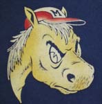
Please use this Font/Lettering for the uniforms from now on

If you are going to add the pony to the uniform, then use this logo

Blue Uniforms for Home Games please.
If you are going to add the pony to the uniform, then use this logo
Blue Uniforms for Home Games please.
-
Big12Mustang 
- Posts: 2224
- Joined: Sun Jan 05, 2014 12:41 am
- Location: Uptown Dallas, TX
Re: 2014-15 uniform thread
![]() by East Coast Mustang » Wed May 07, 2014 2:46 pm
by East Coast Mustang » Wed May 07, 2014 2:46 pm
Don't think LB would go for names on the back, but those look clean otherwise.
2005 PonyFans.com Rookie of the Year Award Recipient
-
East Coast Mustang - Posts: 7433
- Joined: Sat May 21, 2005 8:35 am
Re: 2014-15 uniform thread
![]() by SMU 86 » Wed May 07, 2014 2:59 pm
by SMU 86 » Wed May 07, 2014 2:59 pm
Pony147 wrote:SMU 86 wrote:I thought our last year's home uniform's were very clean looking. I liked them.
Agreed, although I would like a blue uni, especially since so many of our conference foes also have red uniforms
I do think that away unis could be blue but that is just my opinion. I am sure this season's unis will be smooth as well.
"We will play man to man and we will pick you up at the airport." - Larry Brown
________________________Champion________________________
________________________Champion________________________
-
SMU 86 - Posts: 12943
- Joined: Wed Jan 09, 2008 6:41 pm
Re: 2014-15 uniform thread
![]() by Bergermeister » Wed May 07, 2014 3:37 pm
by Bergermeister » Wed May 07, 2014 3:37 pm
ponyinNC wrote:
The watermark jersey is reminiscent of the A. Kenneth Pye mid-court design. Corny.
-
Bergermeister - Posts: 7132
- Joined: Sun Jul 28, 2002 3:01 am
- Location: University Park
50 posts
• Page 1 of 4 • 1, 2, 3, 4
Who is online
Users browsing this forum: No registered users and 3 guests