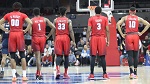
For those wondering about the new ad campaign for basketball, here's a peek at a few concepts for print ads that may (or may not) be chosen.
On http://www.harbenpictures.com/pages/adv ... g%201.html, see the first four photos on the seventh row.
On http://www.harbenpictures.com/pages/adv ... g%202.html, see the first four photos on the third row.
New print ads in development?
Moderators: PonyPride, SmooPower
19 posts
• Page 1 of 2 • 1, 2
New print ads in development?
![]() by CA Mustang » Wed Jul 18, 2007 11:52 am
by CA Mustang » Wed Jul 18, 2007 11:52 am
- CA Mustang

- Posts: 2695
- Joined: Sun Jan 11, 2004 4:01 am
- Location: Elk Grove, CA
Re: New print ads in development?
![]() by MustangIcon » Wed Jul 18, 2007 12:16 pm
by MustangIcon » Wed Jul 18, 2007 12:16 pm
CA Mustang wrote:For those wondering about the new ad campaign for basketball, here's a peek at a few concepts for print ads that may (or may not) be chosen.
On http://www.harbenpictures.com/pages/adv ... g%201.html, see the first four photos on the seventh row.
On http://www.harbenpictures.com/pages/adv ... g%202.html, see the first four photos on the third row.
error messages on both links for me.
- MustangIcon
- Posts: 2604
- Joined: Thu Jan 12, 2006 10:29 am
![]() by CA Mustang » Wed Jul 18, 2007 12:22 pm
by CA Mustang » Wed Jul 18, 2007 12:22 pm
Sorry, I put commas too close to the URL.
Try: http://www.harbenpictures.com/pages/adv ... g%201.html & http://www.harbenpictures.com/pages/adv ... g%202.html
Try: http://www.harbenpictures.com/pages/adv ... g%201.html & http://www.harbenpictures.com/pages/adv ... g%202.html
- CA Mustang
- Posts: 2695
- Joined: Sun Jan 11, 2004 4:01 am
- Location: Elk Grove, CA
![]() by MustangIcon » Wed Jul 18, 2007 12:34 pm
by MustangIcon » Wed Jul 18, 2007 12:34 pm
Sorry, should have been able to figure that out without posting!
The first set of ads is absolutely hillarious, although I don't see SMU actually using them. The second set look pretty cutting edge and are a very cool concept in my opinion.
Any info as to what these are, where you found them, or anything like that?
The first set of ads is absolutely hillarious, although I don't see SMU actually using them. The second set look pretty cutting edge and are a very cool concept in my opinion.
Any info as to what these are, where you found them, or anything like that?
- MustangIcon
- Posts: 2604
- Joined: Thu Jan 12, 2006 10:29 am
![]() by FriscoPMG » Wed Jul 18, 2007 12:43 pm
by FriscoPMG » Wed Jul 18, 2007 12:43 pm
Here's hoping neither of those concepts are used. The first "rich school" theme is too similar to the Rangers' current "You could use some baseball" campaign. Plus while the school has a rep for only having rich snobby kids, I don't think that stereotype falls onto the athletic department too. The football and basketball programs need to worry more about changing their reputation as being losing programs, not rich snobby programs.
And for the 2nd group of ads, those do nothing to generate excitement for an up & coming program. Cobwebs and barbed wire with very little actual SMU branding doesn't seem too effective.
Isn't Richards Group now handling the athletic dept advertising? How are these ad ideas tied to them, if at all?
And for the 2nd group of ads, those do nothing to generate excitement for an up & coming program. Cobwebs and barbed wire with very little actual SMU branding doesn't seem too effective.
Isn't Richards Group now handling the athletic dept advertising? How are these ad ideas tied to them, if at all?
-
FriscoPMG 
- Posts: 769
- Joined: Sun Dec 18, 2005 4:59 am
![]() by Peruna2001 » Wed Jul 18, 2007 12:48 pm
by Peruna2001 » Wed Jul 18, 2007 12:48 pm
MustangIcon wrote:Sorry, should have been able to figure that out without posting!
The first set of ads is absolutely hillarious, although I don't see SMU actually using them. The second set look pretty cutting edge and are a very cool concept in my opinion.
Any info as to what these are, where you found them, or anything like that?
Actually I think that the first set of ads already ran this last year. I know I've already seen the basketball with the designer print. The second set is definitely new and I really like them.
"He was quoting the Bible, Revelations. 'Behold the pale horse.' The man who 'sat on him was Death... and Hell followed with him.'"
"You tell 'em I'm coming... and hell's coming with me!"
"You tell 'em I'm coming... and hell's coming with me!"
-

Peruna2001 - Posts: 677
- Joined: Sun Nov 30, 2003 4:01 am
- Location: Dallas, TX
![]() by abezontar » Wed Jul 18, 2007 12:49 pm
by abezontar » Wed Jul 18, 2007 12:49 pm
The first set is old the first time I remember seeing those photos was when Sasser and Davis were still in school.
The donkey's name is Kiki.
On a side note, anybody need a patent attorney?
Good, Bad...I'm the one with the gun.
On a side note, anybody need a patent attorney?
Good, Bad...I'm the one with the gun.
-

abezontar 
- Posts: 3888
- Joined: Mon Apr 01, 2002 4:01 am
- Location: Mustang, TX
![]() by Grider » Wed Jul 18, 2007 1:22 pm
by Grider » Wed Jul 18, 2007 1:22 pm
Pretty cool, but I think they're both old unless Thomas Andrews and Bryan Remphrey are going to be playing bigger roles this year.
If you look closely at the captions on the black&white ones, it actually lists jersey numbers.
If you look closely at the captions on the black&white ones, it actually lists jersey numbers.
... _ _ .._
-

Grider - Posts: 701
- Joined: Sun Mar 26, 2000 4:01 am
- Location: Lufkin, TX
![]() by CA Mustang » Wed Jul 18, 2007 1:43 pm
by CA Mustang » Wed Jul 18, 2007 1:43 pm
MustangIcon wrote:Any info as to what these are, where you found them, or anything like that?
They came from a photographer that works with the Richards Group.
Grider wrote:...I think they're both old unless Thomas Andrews and Bryan Remphrey are going to be playing bigger roles this year.
Those numbers are probably just place holders, rather than referring to specific players.
- CA Mustang
- Posts: 2695
- Joined: Sun Jan 11, 2004 4:01 am
- Location: Elk Grove, CA
![]() by DiamondM » Wed Jul 18, 2007 5:09 pm
by DiamondM » Wed Jul 18, 2007 5:09 pm
I don't know -- the second set of ads seems kind of cool, but you have to look REALLY hard to figure out that they're related to SMU. We are just not well enough known to have a big photo of a hoop and a tiny superimposed pony in the corner. It makes the viewer work to hard to see what they're advertising. Clever yes, but unfortunately, we don't have the luxury of subtlety.
Maybe I'm wrong here, but with the first set of ads (again, clever though they may be) is that you kind of do have to be in a certain demographic to immediately recognize the point of the ad (I must admit even I didn't immediately get the first one), and I think we either (a) want to appeal to a different demographic (i.e. greater Dallas, non-SMU people) who will still think that by using those images SMU is just reinforcing the stereotype, or (b) want to appeal to SMU people, who will not care that SMU basketball is tough and rich and snobby.
I agree with an earlier poster who pointed out that associating SMU basketball or football with Perrier and Ralph Lauren is not the reason why they don't show up for games. We DO want the average Dallasite to start thinking that being at games is "cool" -- and for some portion of the fan base, thinking that the people attending are rich, social, elite, and hip is actually a draw, rather than a deterrent.
- DiamondM

- Posts: 1623
- Joined: Wed Mar 22, 2000 4:01 am
- Location: Dallas, TX

![]() by smu diamond m » Wed Jul 18, 2007 8:13 pm
by smu diamond m » Wed Jul 18, 2007 8:13 pm
I thought the rich-snob ads were hilarious.
Sir, shooting-star, sir.
Frosh 2005 (TEN YEARS AGO!?!)
The original Heavy Metal.
Frosh 2005 (TEN YEARS AGO!?!)
The original Heavy Metal.
-
smu diamond m - Posts: 4951
- Joined: Fri Apr 14, 2006 3:21 pm
- Location: High on the Hilltop


19 posts
• Page 1 of 2 • 1, 2
Who is online
Users browsing this forum: Google [Bot] and 2 guests