A couple of quick questions please:
1) I would like to buy the baseball cap that Coach Jones wore to his hiring press conference. Does anyone know where I can buy that? Does anyone know if the coaches will be wearing an "assigned" cap on the sidelines next fall as part of the coaches' uniform?
2) Who is SMU's sponsor for jerseys and athletic gear? Is it Adidas or am I wrong?
Thanks very much.
GO PONIES!
Mustang gear for 2008
Moderators: PonyPride, SmooPower
18 posts
• Page 1 of 2 • 1, 2
Mustang gear for 2008
![]() by Texasscout96 » Tue Feb 26, 2008 12:04 pm
by Texasscout96 » Tue Feb 26, 2008 12:04 pm
SMU Grad 1996 - Worked in SMU athletic recruiting office under Forrest Gregg and Bill Weidner from 1992-1997.
- Texasscout96

- Posts: 230
- Joined: Sat Feb 09, 2008 8:39 pm
![]() by PonyPride » Tue Feb 26, 2008 12:58 pm
by PonyPride » Tue Feb 26, 2008 12:58 pm
SMU is now an adidas school - that hat was a Nike hat that was left over from this past season, and therefore won't be sold again.
However, there is a dazzling array of hats here:
http://www.ponyfans.com/catalog/

However, there is a dazzling array of hats here:
http://www.ponyfans.com/catalog/
-

PonyPride 
- Posts: 22410
- Joined: Sat Apr 01, 2000 4:01 am
- Location: Dallas, Texas
![]() by Longtime » Tue Feb 26, 2008 3:40 pm
by Longtime » Tue Feb 26, 2008 3:40 pm
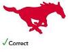
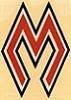
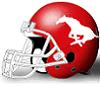
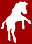
Be sure and buy products that have the right Mustang - the one that's on the football helmet.
The pony with the exaggerated curl in the tail and larger hindquarters is not the real thing, but somehow it has creeped into our products and logos.
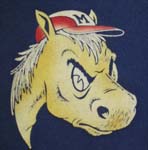
But at least it's better than the Kick'Em Stangs! logo or, even worse, the cartoon horse flexing his bicep.
The pony with the exaggerated curl in the tail and larger hindquarters is not the real thing, but somehow it has creeped into our products and logos.
But at least it's better than the Kick'Em Stangs! logo or, even worse, the cartoon horse flexing his bicep.
-
Longtime 
- Posts: 756
- Joined: Wed Jan 15, 2003 4:01 am
- Location: Dallas, TX
![]() by smu diamond m » Tue Feb 26, 2008 3:43 pm
by smu diamond m » Tue Feb 26, 2008 3:43 pm
I kinda liked the kick 'em stangs logo on the LIDS hats.
Sir, shooting-star, sir.
Frosh 2005 (TEN YEARS AGO!?!)
The original Heavy Metal.
Frosh 2005 (TEN YEARS AGO!?!)
The original Heavy Metal.
-
smu diamond m - Posts: 4951
- Joined: Fri Apr 14, 2006 3:21 pm
- Location: High on the Hilltop

![]() by Longtime » Tue Feb 26, 2008 4:47 pm
by Longtime » Tue Feb 26, 2008 4:47 pm
OK, I'll agree that "Kick'em Stangs" is acceptable as an alternate logo.
It's just that "Kick'em Stangs" has never been, to my knowledge, a phrase traditionally associated with SMU. Then again, neither has "Pony Up." I've always viewed "Kick'em Stangs" as someone's attempt to copy UT's "Hook'em Horns." We don't have to do everything UT does.
The horse flexing his bicep (or rolling up his sleeve?) is just plain horrendous. Sorry, I will never bend on this one.
Fortunately, it looks like both logos have gone the way of the "Superman" script SMU (Arched script with the S bigger than the M which was bigger than the U) that took hold a couple of years ago.
Give me the classic running horse logo. (the RIGHT horse, that is). I'm open to alternative logos, but they better be good. I'd rather see them bring back some of the logos of the long-ago past than most of the new stuff I've seen. Even a somewhat lame logo looks better once it's been deemed retro-cool.
-
Longtime - Posts: 756
- Joined: Wed Jan 15, 2003 4:01 am
- Location: Dallas, TX


![]() by Longtime » Wed Feb 27, 2008 11:53 am
by Longtime » Wed Feb 27, 2008 11:53 am
Augh! Ya got me!
I'm speaking of official SMU merchandise, of course. The stuff marketed to the masses. (if you can call the scarcity of SMU merchandise "marketing").
For a personal avatar, I like to be a little different. If everyone here used the official logo in their avatar, all the avatars would look alike, no?
Tap-tap. Hello? Is this thing on?
-
Longtime - Posts: 756
- Joined: Wed Jan 15, 2003 4:01 am
- Location: Dallas, TX
![]() by BrianTinBigD » Wed Feb 27, 2008 11:59 am
by BrianTinBigD » Wed Feb 27, 2008 11:59 am
I prefer this hat:

The bold Mustangs across the front plus the cool little mustangs across the bill makes this the best SMU hat I have owned.
The bold Mustangs across the front plus the cool little mustangs across the bill makes this the best SMU hat I have owned.
Class of '91
-
BrianTinBigD 
- Posts: 1421
- Joined: Thu Aug 26, 2004 11:39 am
- Location: Allen, Texas
![]() by Bergermeister » Wed Feb 27, 2008 2:07 pm
by Bergermeister » Wed Feb 27, 2008 2:07 pm
I am guessing that since you left the "tag" on your cap that you wear it sideways. (?)
-
Bergermeister - Posts: 7132
- Joined: Sun Jul 28, 2002 3:01 am
- Location: University Park
![]() by SMU Football Blog » Wed Feb 27, 2008 3:50 pm
by SMU Football Blog » Wed Feb 27, 2008 3:50 pm

-

SMU Football Blog - Posts: 4418
- Joined: Mon Jun 20, 2005 1:44 pm
- Location: North Dallas, Texas
![]() by NavyCrimson » Wed Feb 27, 2008 6:28 pm
by NavyCrimson » Wed Feb 27, 2008 6:28 pm
I believe the kick 'em stangs logo goes back to the 40's.
BRING BACK THE GLORY DAYS OF SMU FOOTBALL!!!
For some strange reason, one of the few universities that REFUSE to use their school colors: Harvard Crimson & Yale Blue.
For some strange reason, one of the few universities that REFUSE to use their school colors: Harvard Crimson & Yale Blue.
-
NavyCrimson - Posts: 3163
- Joined: Wed Sep 13, 2000 3:01 am
- Location: Simi Valley-CA (Hm of the Ronald Reagan Presidential Library)
18 posts
• Page 1 of 2 • 1, 2
Who is online
Users browsing this forum: Google [Bot] and 1 guest