SMU Announces Uniform Changes For 2008
Moderators: PonyPride, SmooPower
![]() by Paladin » Wed Jul 02, 2008 8:21 pm
by Paladin » Wed Jul 02, 2008 8:21 pm
Mustang98 wrote:ThadFilms wrote:I think the SMU will be that small, as the press release said they would be stitched on to the jersey.
I'm a fan of the stitching.
Why does "SMU" have to be so small on the front of the shirt? Don't we want to market the school?
My thoughts are that the red mustang on each side of the white helmet will do a pretty good job of marketing the school "brand".....
-

Paladin 
- Posts: 848
- Joined: Sat Sep 10, 2005 3:57 pm
- Location: Grapevine, TX
![]() by gostangs » Wed Jul 02, 2008 8:40 pm
by gostangs » Wed Jul 02, 2008 8:40 pm
This is sooooo overdue. It will be worth at least a win each year. Can't wait to see them come out of the tunnel for the first time with the right uniforms, a real coach, a real coaching staff and real fans in the stands.....oops jumped the gun on that last one...
- gostangs

- Posts: 12315
- Joined: Mon Dec 02, 2002 4:01 am
- Location: Dallas, Texas USA
![]() by Peruna 2K5 » Wed Jul 02, 2008 8:57 pm
by Peruna 2K5 » Wed Jul 02, 2008 8:57 pm
Very nice indeed. Seems the blue jerseys are more of a royal blue as they were during the pony express days. In any event, lets hope this look is here to stay for the long haul.
-

Peruna 2K5 - Posts: 627
- Joined: Tue Jan 01, 2008 12:42 pm
- Location: Corner booth in The Varsity
![]() by expony18 » Wed Jul 02, 2008 9:08 pm
by expony18 » Wed Jul 02, 2008 9:08 pm
i have to disagree... that is a great looking uniform; however, the SMU makes it look like a pop warner team... i like the small version of SMU, otherwise the jersey is too clutteredjtstang wrote:MustangStealth wrote:As for the striping, I seriously doubt it is asymmetrical. It looks like the same blue-white-red-white-blue pattern on these.
This is a great look. The "SMU" depicted on the new jerseys is kind of tiny, I hope the letters are bigger in real life.

- expony18
- Posts: 9968
- Joined: Thu Dec 08, 2005 2:54 pm
![]() by Stallion » Wed Jul 02, 2008 9:14 pm
by Stallion » Wed Jul 02, 2008 9:14 pm
the new uniform is much more cluttered than that uniform. Numbers on top-stripes on shoulders. When you got a great color scheme keep it traditional, simple and clean like UT, OU, Arkansas, Alabama, Michigan, A&M, Nebraska, Tennessee, Georgia, These new additions like stripes on shoulders and numbers on top just distract from the classic SMU uniform.
- Stallion
- Posts: 44302
- Joined: Tue Dec 19, 2000 4:01 am
- Location: Dallas,Texas,USA
![]() by mrydel » Wed Jul 02, 2008 9:21 pm
by mrydel » Wed Jul 02, 2008 9:21 pm
I tend to agree with Stallion. I love the colors and the helmets are finally right, but I do wish the jerseys were not quite so busy. Now if they start slapping those CUSA logos on there also, it will look like Roy McElvoy's golf shirt in Tin Cup.
All those who believe in psycho kinesis, raise my hand
-

mrydel - Posts: 32035
- Joined: Sat Feb 01, 2003 4:01 am
- Location: Sherwood,AR,USA
![]() by expony18 » Wed Jul 02, 2008 9:21 pm
by expony18 » Wed Jul 02, 2008 9:21 pm
i agree that the stripes/shoulder numbers make it look a little cluttered, but the "SMU" on the 2000/2001 was way to big. You knew that adidas/jones were going to put their own stamp on the uniform... i would wait to say the stripes make it to cluttered, a lot of that will depend on the scale/cut of the uniform...
- expony18
- Posts: 9968
- Joined: Thu Dec 08, 2005 2:54 pm
![]() by mrydel » Wed Jul 02, 2008 9:24 pm
by mrydel » Wed Jul 02, 2008 9:24 pm
expony18 wrote:i agree that the stripes/shoulder numbers make it look a little cluttered, but the "SMU" on the 2000/2001 was way to big. You knew that adidas/jones were going to put their own stamp on the uniform... i would wait to say the stripes make it to cluttered, a lot of that will depend on the scale/cut of the uniform...
I will wait, and overall I am delighted with the change. I think everyone of us would have a different design if we did our own. It is a huge improvement.
All those who believe in psycho kinesis, raise my hand
-
mrydel - Posts: 32035
- Joined: Sat Feb 01, 2003 4:01 am
- Location: Sherwood,AR,USA
![]() by SMU 86 » Wed Jul 02, 2008 9:35 pm
by SMU 86 » Wed Jul 02, 2008 9:35 pm
Stallion wrote:the new uniform is much more cluttered than that uniform. Numbers on top-stripes on shoulders. When you got a great color scheme keep it traditional, simple and clean like UT, OU, Arkansas, Alabama, Michigan, A&M, Nebraska, Tennessee, Georgia, These new additions like stripes on shoulders and numbers on top just distract from the classic SMU uniform.
Are you talking about those black stripes on the Jersey? If so I agree.
"We will play man to man and we will pick you up at the airport." - Larry Brown
________________________Champion________________________

________________________Champion________________________
-

SMU 86 - Posts: 12943
- Joined: Wed Jan 09, 2008 6:41 pm
![]() by expony18 » Wed Jul 02, 2008 9:41 pm
by expony18 » Wed Jul 02, 2008 9:41 pm
i think we can all be happy with the change though... its a sharp looking jersey.... you can't make everyone happymrydel wrote:expony18 wrote:i agree that the stripes/shoulder numbers make it look a little cluttered, but the "SMU" on the 2000/2001 was way to big. You knew that adidas/jones were going to put their own stamp on the uniform... i would wait to say the stripes make it to cluttered, a lot of that will depend on the scale/cut of the uniform...
I will wait, and overall I am delighted with the change. I think everyone of us would have a different design if we did our own. It is a huge improvement.
- expony18
- Posts: 9968
- Joined: Thu Dec 08, 2005 2:54 pm
![]() by BrianTinBigD » Wed Jul 02, 2008 10:51 pm
by BrianTinBigD » Wed Jul 02, 2008 10:51 pm
I have already sent in the pictures to my uniform providers. I will check and see what the adult cost would be for the red or the white unis will be and I will post it in case anyone wants to see about ordering them with me teams order. I would offer up the blue but we own red in our league and our alternates this year will be white.
Class of '91
-

BrianTinBigD 
- Posts: 1421
- Joined: Thu Aug 26, 2004 11:39 am
- Location: Allen, Texas
![]() by ThadFilms » Wed Jul 02, 2008 10:59 pm
by ThadFilms » Wed Jul 02, 2008 10:59 pm
While I was a fan of the big SMU back in the day.... I think the stitching will be classy. I have to agree and disagree with Stallion and expony...
I agree the shoulder numbers can clutter things. It just depends on the size. If they are compact, great. I think shoulder numbers are there for the announcers, frankly.
The stripes - and this is merely a guess - I just feel like they are going to be positioned, sized and cut correctly. So in summation, we do have to wait and see. I really do think we're going to be happy with it.
Looking forward to buying the white! (I have reds and blues already.... and always my favorite pony look was the all all white with the white helmet... totally cool.)
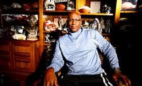
Eric Dickerson in Pony Excess
"I've love winning man, it's like better than losing." - Ebby Calvin "Nuke" LaLoosh
-

ThadFilms - Posts: 6607
- Joined: Fri Jan 17, 2003 4:01 am
- Location: Austin TX / Dallas TX / Hollywoodland CA


Who is online
Users browsing this forum: Google [Bot] and 4 guests