Couple of thoughts.
1) Is this why some fans are saying the current Pony looks smaller on the helmet?
2) Looks 2007 colors are more pale than 2013. PK, which are the CORRECT hues?
2013 Peruna Logo vs. 2007 Peruna Logo
Moderators: PonyPride, SmooPower
-
SoCal_Pony

- PonyFans.com Super Legend

- Posts: 5901
- Joined: Sun Jan 05, 2003 4:01 am
-
DanFreibergerForHeisman

- PonyFans.com Super Legend
- Posts: 16486
- Joined: Mon Jul 24, 2000 3:01 am
- Contact:
Re: 2013 Peruna Logo vs. 2007 Peruna Logo
SMU fans should NEVER use "'Stangs".
Kick 'em Mustangs is kind of SWCish ,so whatever. The band says "Ride 'em Mustangs" at the end of their show ,but that doesn't make much sense,, now does it?
As for the logo - this is a big deal. It has been hard enough to rid inventory of the phony phony, and now we have gone and secretly (or unknowingly) changed our official logo as well. Unbelievable.
Shake It Off Moody

Re: 2013 Peruna Logo vs. 2007 Peruna Logo
Awe F*ck It!Digetydog wrote:How about F... 'Em?SMUer wrote:Why? Every one else in Texas has a catchy 'em slogan:blackoutpony wrote:Kick'em Stangs is just an awful slogan.
Gig 'em
Sic 'em
Hook 'em
Wreck 'em
To me it just nods to the fact that we used to be at the same level as these schools.
Leader of the Band-itos.
Mustangsabu wrote:
Malonish! You are the man!
PonyPride:
I think malonish is right
peruna81:
God bless you, malonish.

Mustangsabu wrote:
Malonish! You are the man!
PonyPride:
I think malonish is right
peruna81:
God bless you, malonish.

Re: 2013 Peruna Logo vs. 2007 Peruna Logo
Hoof 'em!SMUer wrote:Why? Every one else in Texas has a catchy 'em slogan:blackoutpony wrote:Kick'em Stangs is just an awful slogan.
Gig 'em
Sic 'em
Hook 'em
Wreck 'em
To me it just nods to the fact that we used to be at the same level as these schools.

Re: 2013 Peruna Logo vs. 2007 Peruna Logo
The inconsistency of the Peruna logo dilutes the SMU brand. The phony pony is already a bad issue, but internally (whoever SMU paid to knowingly or unknowingly change the artwork) should not be adding to the problem.
-
PK

- PonyFans.com Super Legend
- Posts: 8805
- Joined: Wed Sep 06, 2000 3:01 am
- Location: Dallas, Texas 75206
Re: 2013 Peruna Logo vs. 2007 Peruna Logo
2013 is closer to correct color, but still too "red". 2007 red is worse as it has a bit of orange tint to it.SoCal_Pony wrote:Couple of thoughts.
1) Is this why some fans are saying the current Pony looks smaller on the helmet?
2) Looks 2007 colors are more pale than 2013. PK, which are the CORRECT hues?
Harvard crimson:


But then their uniforms are yet a little different.

Last edited by PK on Wed Nov 06, 2013 10:40 pm, edited 1 time in total.
SMU's first president, Robert S. Hyer, selected Harvard Crimson and Yale Blue as SMU's colors to symbolize SMU's high academic standards. We are one of the few Universities to have school colors with real meaning...and we just blow them off.
Re: 2013 Peruna Logo vs. 2007 Peruna Logo
Technically, both of the logo sheets I pulled (2007 & 2013) both came from SMUMustangs.com. Both sheets state official colors are PMS 186 and 286.SoCal_Pony wrote:Couple of thoughts.
1) Is this why some fans are saying the current Pony looks smaller on the helmet?
2) Looks 2007 colors are more pale than 2013. PK, which are the CORRECT hues?
Re: 2013 Peruna Logo vs. 2007 Peruna Logo
PMS is the Pantone Matching System for those who are ignorant to the acronym.
-
SMUer

- PonyFans.com Super Legend
- Posts: 5276
- Joined: Sun Oct 28, 2007 12:03 pm
- Location: Dallas, Texas, The United States of America
Re: 2013 Peruna Logo vs. 2007 Peruna Logo
"Peruna needs skinnier legs and an arsehole pucker"...can you believe it's someone's job to approve of such things?
Whoever you are...kill the PhonyPony, ditch "SMU Red/Blue" altogether and let's get back to our "Harvard Red/Yale Blue" roots!
Whoever you are...kill the PhonyPony, ditch "SMU Red/Blue" altogether and let's get back to our "Harvard Red/Yale Blue" roots!
-
couch 'em

- PonyFans.com Super Legend
- Posts: 9758
- Joined: Wed Sep 04, 2002 3:01 am
- Location: Farmers Branch
Re: 2013 Peruna Logo vs. 2007 Peruna Logo
The 2013 butt looks closer to this 1979 Tom Lisle helmet
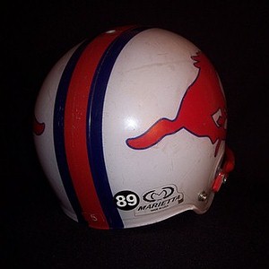
"I think Couchem is right."
-EVERYONE
-EVERYONE


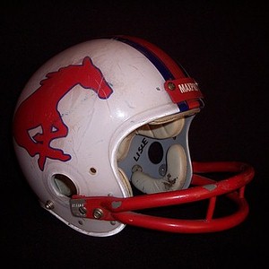
Re: 2013 Peruna Logo vs. 2007 Peruna Logo
couch 'em wrote:The 2013 butt looks closer to this 1979 Tom Lisle helmet
This is how our stripes should look now, but the blue stripes now are barely visible.