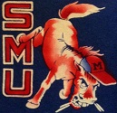
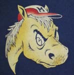
Ugliest Uniform Look Since Phil Bennett's Disaster
Moderators: PonyPride, SmooPower
-
PoconoPony
- PonyFans.com Legend

- Posts: 4436
- Joined: Mon Aug 25, 2008 8:01 pm
- Location: Nesquehoning, Pennsylvania
Re: Ugliest Uniform Look Since Phil Bennett's Disaster
Red helmets and red uniforms are hideous. Red helmet might be alright with white uniforms, but I would need to see the match before passing judgment. There is no doubt in my mind that the standard classy and classic helmet should be the white which goes great with red, blue or white uniforms.
Re: Ugliest Uniform Look Since Phil Bennett's Disaster
ponyte wrote:I think we looked like a Houston team. Not bad just not innovative. Many teams have color matching helmets, jerseys and even pants.
What I like, is we are experimenting with the best looks from our past. We are not doing bizarre combinations like Maryland or Oregon.
We take the helmets from the Fry era, jerseys from the Pony Express era and match them with the present era. I like that. We are giving kids options in the uniforms and honoring our past.
Some folks have issues that jones doesn't honor our past or traditions. Yet, this year, he has done something few teams have done and that is to take the traditions and glory form our past uniforms and present them to his team and us the fans. How many of us have longed for Pony Express jerseys. The Jerry Levis era helmets? Now, we are getting them and all we can do is whine about it.
We are not dreaming up uniforms that look like Max Factor and Andy Warhol were collaborating to make the most pop art uniform ever. We are experimenting with the best from our past and trying to find how to best incorporate that past with the present.
It may not be aesthetically pleasing, but at least we are acknowledging our past and trying to honor it as we move forward.
Well said.
I was going to add further thoughts, but none are needed.
-
PoconoPony
- PonyFans.com Legend
- Posts: 4436
- Joined: Mon Aug 25, 2008 8:01 pm
- Location: Nesquehoning, Pennsylvania
Re: Ugliest Uniform Look Since Phil Bennett's Disaster
Rayburn wrote:ponyte wrote:I think we looked like a Houston team. Not bad just not innovative. Many teams have color matching helmets, jerseys and even pants.
What I like, is we are experimenting with the best looks from our past. We are not doing bizarre combinations like Maryland or Oregon.
We take the helmets from the Fry era, jerseys from the Pony Express era and match them with the present era. I like that. We are giving kids options in the uniforms and honoring our past.
Some folks have issues that jones doesn't honor our past or traditions. Yet, this year, he has done something few teams have done and that is to take the traditions and glory form our past uniforms and present them to his team and us the fans. How many of us have longed for Pony Express jerseys. The Jerry Levis era helmets? Now, we are getting them and all we can do is whine about it.
We are not dreaming up uniforms that look like Max Factor and Andy Warhol were collaborating to make the most pop art uniform ever. We are experimenting with the best from our past and trying to find how to best incorporate that past with the present.
It may not be aesthetically pleasing, but at least we are acknowledging our past and trying to honor it as we move forward.
Well said.
I was going to add further thoughts, but none are needed.
If we are really looking for our roots then dump our current hideous Nike red and actually use the Harvard red wine color and more subdued Yale blue. Together they would give us a great look and unique instant identification rather than looking just like Nebraska, Wisconsin, North Carolina State, Houston,...etc. and everyone else who Nike or Adidas deems to use exactly the same red and blue.
Re: Ugliest Uniform Look Since Phil Bennett's Disaster
PoconoPony wrote:If we are really looking for our roots then dump our current hideous Nike red and actually use the Harvard red wine color and more subdued Yale blue. Together they would give us a great look and unique instant identification rather than looking just like Nebraska, Wisconsin, North Carolina State, Houston,...etc. and everyone else who Nike or Adidas deems to use exactly the same red and blue.
Totally agree.
-
NavyCrimson

- PonyFans.com Legend
- Posts: 3165
- Joined: Wed Sep 13, 2000 3:01 am
- Location: Simi Valley-CA (Hm of the Ronald Reagan Presidential Library)
Re: Ugliest Uniform Look Since Phil Bennett's Disaster
SECOND!!!!
BRING BACK THE GLORY DAYS OF SMU FOOTBALL!!!
For some strange reason, one of the few universities that REFUSE to use their school colors: Harvard Crimson & Yale Blue.
For some strange reason, one of the few universities that REFUSE to use their school colors: Harvard Crimson & Yale Blue.
-
Treadway21
- PonyFans.com Super Legend
- Posts: 6586
- Joined: Thu Nov 18, 2004 2:14 pm
- Location: Dallas, TX
Re: Ugliest Uniform Look Since Phil Bennett's Disaster
Third.
An atheist is a guy who watches a Notre Dame-SMU football game and
doesn't care who wins.
-- Dwight D. Eisenhower
doesn't care who wins.
-- Dwight D. Eisenhower
-
PonyKris89
- Heisman

- Posts: 1877
- Joined: Sun Oct 02, 2011 1:43 pm
- Location: Aubrey, Tx
Re: Ugliest Uniform Look Since Phil Bennett's Disaster
ponyte wrote:I think we looked like a Houston team. Not bad just not innovative. Many teams have color matching helmets, jerseys and even pants.
What I like, is we are experimenting with the best looks from our past. We are not doing bizarre combinations like Maryland or Oregon.
We take the helmets from the Fry era, jerseys from the Pony Express era and match them with the present era. I like that. We are giving kids options in the uniforms and honoring our past.
Some folks have issues that jones doesn't honor our past or traditions. Yet, this year, he has done something few teams have done and that is to take the traditions and glory form our past uniforms and present them to his team and us the fans. How many of us have longed for Pony Express jerseys. The Jerry Levis era helmets? Now, we are getting them and all we can do is whine about it.
We are not dreaming up uniforms that look like Max Factor and Andy Warhol were collaborating to make the most pop art uniform ever. We are experimenting with the best from our past and trying to find how to best incorporate that past with the present.
It may not be aesthetically pleasing, but at least we are acknowledging our past and trying to honor it as we move forward.
And PoconoPony...
If we are really looking for our roots then dump our current hideous Nike red and actually use the Harvard red wine color and more subdued Yale blue. Together they would give us a great look and unique instant identification rather than looking just like Nebraska, Wisconsin, North Carolina State, Houston,...etc. and everyone else who Nike or Adidas deems to use exactly the same red and blue.
Well stated PonyTE and PoconoPony .
I applaud SMU opening up the Uniform play book!
And If we are going to continue wearing Red, use the correct Harvard color without stupid shoulder stripes, and yes as pointed out earlier in the thread, go with the old classic Khaki Pants! The Khaki pants are classy and differentiate from all other NCAA Unis. And of course, I love our classic blues.
We have the best damn colors and logo in college football, we have a lot of great options.
Beat the hell out of anybody!
-
PonyKris89
- Heisman
- Posts: 1877
- Joined: Sun Oct 02, 2011 1:43 pm
- Location: Aubrey, Tx
Re: Ugliest Uniform Look Since Phil Bennett's Disaster
PonyKris89 wrote:ponyte wrote:I think we looked like a Houston team. Not bad just not innovative. Many teams have color matching helmets, jerseys and even pants.
What I like, is we are experimenting with the best looks from our past. We are not doing bizarre combinations like Maryland or Oregon.
We take the helmets from the Fry era, jerseys from the Pony Express era and match them with the present era. I like that. We are giving kids options in the uniforms and honoring our past.
Some folks have issues that jones doesn't honor our past or traditions. Yet, this year, he has done something few teams have done and that is to take the traditions and glory form our past uniforms and present them to his team and us the fans. How many of us have longed for Pony Express jerseys. The Jerry Levis era helmets? Now, we are getting them and all we can do is whine about it.
We are not dreaming up uniforms that look like Max Factor and Andy Warhol were collaborating to make the most pop art uniform ever. We are experimenting with the best from our past and trying to find how to best incorporate that past with the present.
It may not be aesthetically pleasing, but at least we are acknowledging our past and trying to honor it as we move forward.
And PoconoPony stated...
"If we are really looking for our roots then dump our current hideous Nike red and actually use the Harvard red wine color and more subdued Yale blue. Together they would give us a great look and unique instant identification rather than looking just like Nebraska, Wisconsin, North Carolina State, Houston,...etc. and everyone else who Nike or Adidas deems to use exactly the same red and blue"
Well said PonyTE and PoconoPony !
I applaud SMU opening up the Uniform play book!
And If we are going to continue wearing Red, use the correct Harvard color without stupid shoulder stripes, and yes as pointed out earlier in the thread, go with the old classic Khaki Pants! The Khaki pants are classy and differentiate SMU from all other NCAA Unis. And of course, I love our classic blues.
We have the best damn colors and logo in college football, we have a lot of great options.
Beat the hell out of anybody!
-
NavyCrimson
- PonyFans.com Legend
- Posts: 3165
- Joined: Wed Sep 13, 2000 3:01 am
- Location: Simi Valley-CA (Hm of the Ronald Reagan Presidential Library)
Re: Ugliest Uniform Look Since Phil Bennett's Disaster
I have a good - positive feeling next year - we're going to get what we've been wishing for - at least as a retro or alternative uni. Something is definitely happening in the kitchen!
I just hope & pray the athletic dept. is listening to us.
I just hope & pray the athletic dept. is listening to us.
BRING BACK THE GLORY DAYS OF SMU FOOTBALL!!!
For some strange reason, one of the few universities that REFUSE to use their school colors: Harvard Crimson & Yale Blue.
For some strange reason, one of the few universities that REFUSE to use their school colors: Harvard Crimson & Yale Blue.
-
dirtysouthpony
- Varsity

- Posts: 435
- Joined: Fri Jul 29, 2011 3:30 am
Re: Ugliest Uniform Look Since Phil Bennett's Disaster
I was watching steelers game this weekend, and I saw the packers do this earlier. Khaki pants. Didn't we wear those back in the Doak days? The would look really cool with the red helmets.
-
Bergermeister
- PonyFans.com Super Legend
- Posts: 7132
- Joined: Sun Jul 28, 2002 3:01 am
- Location: University Park
Re: Ugliest Uniform Look Since Phil Bennett's Disaster
BIGHORSE wrote:The red hats would have looked good with the blue jerseys, but once again
june gave us the middle finger.
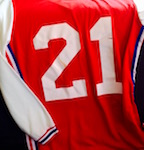
June gave me a thumbs-up. Thought the red helmet-red jersey combo was impressive. BTW, the red basketball uniforms (vs Arkansas) looked great, too. Not everybody sings th' blues.
-
NavyCrimson
- PonyFans.com Legend
- Posts: 3165
- Joined: Wed Sep 13, 2000 3:01 am
- Location: Simi Valley-CA (Hm of the Ronald Reagan Presidential Library)
Re: Ugliest Uniform Look Since Phil Bennett's Disaster
'Southpony: "I was watching steelers game this weekend, and I saw the packers do this earlier. Khaki pants. Didn't we (SMU) wear those back in the Doak days? ..."
Yes, we did. But like many schools of that era, most everyone wore khaki pants & then sometime in the late 40's or 50's we changed to gray.
For the schools that had gold as a color - ND, Navy, Purdue, et al. for their pants, they wore the khakis well into the 60's, 70's & 80's until the manufacturers had gold tints & yellows more available. Then they switched over. The 'khaki' color was their 'gold'.
I believe I'm correct on this chronology.
BRING BACK THE GLORY DAYS OF SMU FOOTBALL!!!
For some strange reason, one of the few universities that REFUSE to use their school colors: Harvard Crimson & Yale Blue.
For some strange reason, one of the few universities that REFUSE to use their school colors: Harvard Crimson & Yale Blue.
-
Stallion
- PonyFans.com Super Legend
- Posts: 44302
- Joined: Tue Dec 19, 2000 4:01 am
- Location: Dallas,Texas,USA
Re: Ugliest Uniform Look Since Phil Bennett's Disaster
The reason we don't wear Harvard Red and Yale Blue is quite frankly they are UGLY colors-that's the bottomline why we have NEVER worn them. And I'm quite relieved we haven't and never will
"With a quarter of a tank of gas, we can get everything we need right here in DFW." -SMU Head Coach Chad Morris
When momentum starts rolling downhill in recruiting-WATCH OUT.
When momentum starts rolling downhill in recruiting-WATCH OUT.


Re: Ugliest Uniform Look Since Phil Bennett's Disaster
I know this is a beaten thread, but what are thoughts about an all-red uniform (helmet, jersey, pants) alternated with white helmet, blue jerseys and white pants for home games. Alternate red helmet and white helmet (depending on home team) with all-white threads for away. I think completely monochromatic is in right now, and how hard/costly could it really be to get red pants? I guess the stripes on the red jerseys need to go too. Ahhhh whatever, I was right, this is a beaten thread.
"In a bacon and egg breakfast the chicken is involved, but the pig is committed. Be that pig."
-Brian Billick
-Brian Billick
-
NavyCrimson
- PonyFans.com Legend
- Posts: 3165
- Joined: Wed Sep 13, 2000 3:01 am
- Location: Simi Valley-CA (Hm of the Ronald Reagan Presidential Library)
Re: Ugliest Uniform Look Since Phil Bennett's Disaster
Well you're a minority for sure - Stallion.
BRING BACK THE GLORY DAYS OF SMU FOOTBALL!!!
For some strange reason, one of the few universities that REFUSE to use their school colors: Harvard Crimson & Yale Blue.
For some strange reason, one of the few universities that REFUSE to use their school colors: Harvard Crimson & Yale Blue.