blackoutpony wrote:The ones with the shoulder stripes are absolutely awful. Looks like something a JV football team would wear.
I'm also not sure why the had to butcher "SMU" and make it look like something a middle school team would use for lettering.
The all blue could be good, but they don't even say SMU. What we have now is better.
I like the grey one and I almost never like grey one. They are cool.
[deleted] the blue mustang. No....
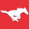
This should be the logo used in those jerseys.
The blue mustang is a phony pony...
The military uniforms are way better than those horrible ones we wore vs. Army in our bowl game. --------- I posted all the pictures on that page-does not necessarily mean that I like everything there.
SMU's first president, Robert S. Hyer, selected Harvard Crimson and Yale Blue as SMU's colors to symbolize SMU's high academic standards. We are one of the few Universities to have school colors with real meaning...and we just blow them off.
I really like some of these. I am still partial to SMU1523's renderings.
I never liked the Bennett navy blue helmets, felt that the pony didn't pop on that helmet. On the blue helmets here, they definitely seem to pop more with these colors and borders.
I kinda like blocked off differing color on shoulder pads, and I definitely like this better than those crappy shoulder stripes that we currently have.
and I'm still very partial to classic Blue Pony Express era with SMU above numbers, and would like to see that same dud done in red. I believe Hart said they were considering the red in that style.
Never a fan of gray.
How about some Khaki pants?
Last edited by PonyKris89 on Sat Feb 22, 2014 11:43 pm, edited 1 time in total.