This is the forum for talk about SMU Football
Moderators: PonyPride , SmooPower
mustangxc
PonyFans.com Super Legend
Posts: 7339 Joined: Tue Nov 14, 2006 3:57 pm
Post
by mustangxc Mon Feb 24, 2014 1:14 pm
skurtn wrote: 3 things I hope individuals who like to design uniforms should use as a "done criteria" are:
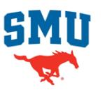
The mascot for our uniforms is the Mustang, pointed left. It's red, always red. Our shade of red and blue are precise colors; Harvard Red and Yale Blue, no changing them. We're the SMU Mustangs, not "Mustangs". The school logo should be priority #1, when practical. The rest is creative freedom.
Technically, our colors are now SMU red and SMU blue.
skurtn
All-American
Posts: 592 Joined: Fri Sep 16, 2011 8:40 amLocation: Richmond, TX
Post
by skurtn Mon Feb 24, 2014 2:52 pm
Ah, I'm behind the times. Anyways, my points still stand
Bergermeister
PonyFans.com Super Legend
Posts: 7132 Joined: Sun Jul 28, 2002 3:01 amLocation: University Park
Post
by Bergermeister Mon Feb 24, 2014 3:52 pm
SMUer wrote: This should be the game plan...fanciness later
All of these look
great - skip the state of Texas emblem, though.
clayboy37
Recruit
Posts: 48 Joined: Mon Feb 10, 2014 2:12 pm
Post
by clayboy37 Mon Feb 24, 2014 4:30 pm
[list][*]The mascot for our uniforms is the Mustang, pointed left. It's red, always red.[/quote]
SMU1523
Heisman
Posts: 1351 Joined: Tue Oct 12, 2010 9:03 pmLocation: Dallas, TX
Post
by SMU1523 Mon Feb 24, 2014 6:35 pm
In design, it's the little things that matter. Font, kerning, color palette, placement, size of striping, and with most established brands, the history. Bold, new, and modern only go so far. A truly good design should capture the true essence of what you want your brand to reflect. It is not just a uniform, but an icon for an institution.
Junior
PonyFans.com Super Legend
Posts: 11513 Joined: Sat Nov 25, 2006 11:56 amLocation: Dallas, TX
Post
by Junior Mon Feb 24, 2014 7:06 pm
these are generally ridiculous. especially the one that looks like the New York Football Giants.
Derail the Frogs!
NavyCrimson
PonyFans.com Legend
Posts: 3165 Joined: Wed Sep 13, 2000 3:01 amLocation: Simi Valley-CA (Hm of the Ronald Reagan Presidential Library)
Post
by NavyCrimson Mon Feb 24, 2014 10:28 pm
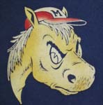
Would love to see more of the diamond 'M' used in all our logos. Tradition-wise, that's one of the oldest & most recognizable for SMU.
BRING BACK THE GLORY DAYS OF SMU FOOTBALL!!! Harvard Crimson Yale Blue
couch 'em
PonyFans.com Super Legend
Posts: 9758 Joined: Wed Sep 04, 2002 3:01 amLocation: Farmers Branch
Post
by couch 'em Mon Feb 24, 2014 10:40 pm
clayboy37 wrote: [list][*]The mascot for our uniforms is the Mustang, pointed left. It's red, always red.
Interesting, I've never heard the Mustang has to point left.[/quote]
I think someone is confused
"I think Couchem is right."
East Coast Mustang
PonyFans.com Super Legend
Posts: 7434 Joined: Sat May 21, 2005 8:35 am
Post
by East Coast Mustang Mon Feb 24, 2014 11:08 pm
The uniforms we had during June's first year were perfect. We should go back to those
2005 PonyFans.com Rookie of the Year Award Recipient
SMU Section F
Heisman
Posts: 1479 Joined: Mon Feb 06, 2012 3:33 pm
Post
by SMU Section F Mon Feb 24, 2014 11:44 pm
East Coast Mustang wrote: The uniforms we had during June's first year were perfect. We should go back to those
Easily my favorite uniforms the team has worn since I became an SMU fan.
Fresno Mustang
All-American
Posts: 844 Joined: Mon Nov 26, 2012 2:41 am
Post
by Fresno Mustang Tue Feb 25, 2014 1:26 am
Bergermeister wrote: SMUer wrote: This should be the game plan...fanciness later
All of these look
great - skip the state of Texas emblem, though.
I like the Texas logo. We should play off the texas theme more and put it on our uniform in some capacity (like a state emblem on the hip).
SMU Class of 2014
NavyCrimson
PonyFans.com Legend
Posts: 3165 Joined: Wed Sep 13, 2000 3:01 amLocation: Simi Valley-CA (Hm of the Ronald Reagan Presidential Library)
Post
by NavyCrimson Tue Feb 25, 2014 1:44 am
I agree. Keep the TX emblem.
BRING BACK THE GLORY DAYS OF SMU FOOTBALL!!! Harvard Crimson Yale Blue
ojaipony
PonyFans.com Super Legend
Posts: 8281 Joined: Tue Jun 21, 2011 5:02 pmLocation: Austin, TX
Post
by ojaipony Tue Feb 25, 2014 3:50 am
SMU Section F wrote: East Coast Mustang wrote: The uniforms we had during June's first year were perfect. We should go back to those
Easily my favorite uniforms the team has worn since I became an SMU fan.
This ^.
Damn, it's not that complicated (frustration at the athletic dept not ponyfans). The last 2 concepts are the right ones. It's very simple. You got it right with the new Moody floor. Now, just take it to our uniforms. It's not rocket science. Damn!
BIGHORSE
Hall of Famer
Posts: 2882 Joined: Mon Oct 04, 2004 7:49 pm
Post
by BIGHORSE Tue Feb 25, 2014 7:42 am
East Coast Mustang wrote: The uniforms we had during June's first year were perfect. We should go back to those
Make the stripes on the helmets and pants like this again, but lose the stripes
on the jerseys.