

http://www.onefootdown.com/2012/3/12/28 ... e-football
Hopefully Nike doesn't spaz them out.
Underrated Uniforms
Moderators: PonyPride, SmooPower
-
LakeHighlandsPony
- Hall of Famer

- Posts: 2558
- Joined: Fri Nov 05, 2004 8:50 am
- Location: The Boneyard
Re: Underrated Uniforms
He nailed every point except bringing back the blue jerseys. I also want the white shoes back.
-
ponyte
- PonyFans.com Super Legend

- Posts: 11220
- Joined: Wed Jan 15, 2003 4:01 am
- Location: Nw Orleans, LA region
- Contact:
Re: Underrated Uniforms
Thank you Ron Meyer for winning and designing a classic uniform.

Re: Underrated Uniforms
A little boring to me. Nike should a bit of flare to it and keep it tasteful.
"We will play man to man and we will pick you up at the airport." - Larry Brown
________________________Champion________________________

________________________Champion________________________
-
redpony
- PonyFans.com Super Legend
- Posts: 10968
- Joined: Tue Jan 01, 2008 8:44 am
- Location: on the beach,northern Peru
Re: Underrated Uniforms
the two words nike and tasteful are an oxymoron.
-
PK

- PonyFans.com Super Legend
- Posts: 8805
- Joined: Wed Sep 06, 2000 3:01 am
- Location: Dallas, Texas 75206
Re: Underrated Uniforms
redpony wrote:the two words nike and tasteful are an oxymoron.
Exactly.
SMU's first president, Robert S. Hyer, selected Harvard Crimson and Yale Blue as SMU's colors to symbolize SMU's high academic standards. We are one of the few Universities to have school colors with real meaning...and we just blow them off.
-
gostangs
- PonyFans.com Super Legend
- Posts: 12315
- Joined: Mon Dec 02, 2002 4:01 am
- Location: Dallas, Texas USA
Re: Underrated Uniforms
but the words nike and great recruits go together quite well - and that is all i care about. If they win i dont care if they wear pink and salmon swirls.
-
redpony
- PonyFans.com Super Legend
- Posts: 10968
- Joined: Tue Jan 01, 2008 8:44 am
- Location: on the beach,northern Peru
Re: Underrated Uniforms
then you are about to create another oxymoron. Great recruits and JJ. It's kind of hard to get great recruits when you don't believe in high profile, high activity recruiting.
-
Bergermeister
- PonyFans.com Super Legend
- Posts: 7132
- Joined: Sun Jul 28, 2002 3:01 am
- Location: University Park
Re: Underrated Uniforms
redpony wrote: It's kind of hard to get great recruits when you don't believe in high profile, high activity recruiting.
I think we know where you stand on the issue.
-
redpony
- PonyFans.com Super Legend
- Posts: 10968
- Joined: Tue Jan 01, 2008 8:44 am
- Location: on the beach,northern Peru
Re: Underrated Uniforms
thought I had better expound a little more for the sake of any aggies, froggies or cougar high kids that may read this board. 


Re: Underrated Uniforms
Congratulations on telling the incoming freshmen that they're not great players and they were some kind of afterthoughts. Couldn't be further from the truth, and once and for all, just because the coaches don't rush to the pay sites to say "I made a phone call! I sent a letter!" doesn't mean they're not recruiting.
But back to the original topic: the uniforms. (Assessments here are based on the photos shown, as many schools have multiple options that aren't pictured.)
SMU: Any description other than "best uniform in the country" is inaccurate. It would be much better with royal blue jerseys and blue or white facemasks, but until Nike comes in and screws it up, we have great uniforms.
Grade: A-
Virginia: Pretty good, actually. A lot of blue/orange mixes look like crap (see Syracuse, UTEP, etc.), but UVa's is pretty sharp. Classic-but-not-overbearing logo. Sleeves aren't quite long enough, but better than the tucked-up-to-the-armpits stuff that is rampant everywhere.
Grade: B
Virginia Tech: Terrible. Anything with maroon and orange (in any style or combination) should be shredded immediately. There is no way to make that uniform look good, and the look with one colored sleeve should have gotten someone fired. Multiple people, actually -- whoever designed it, and whoever agreed to let a team play in it.
Grade: F
Rutgers: Excellent. Might change the font of the number on the jersey, but other than that, it's a clean look that really works (although red in the jersey and helmet don't quite match. That must be corrected.)
Grade: B+
Syracuse: See the comment above about blue and orange not going well together. The white basketball uniforms with orange only are OK, but this crap looks like something that shouldn't be forced on anyone above a youth recreational league that gets its uniforms donated by the local dry cleaner or tire store.
Grade: D-
Baylor: Burn them. This is disgusting. The colors are awful, as if someone in Notre Dame's (also-ugly) green jerseys slept with one of the Oakland A's. The metallic helmet is a different shade of yellow/gold/vomit than the pants, and the green and white stripes make an already-ugly helmet worse. Perfect for Baylor and Waco, come to think of it.
Grade: D-
Kansas State: Not bad, which is surprising for something that uses a color even close to TCU's purple (they're close, but not identical). Sleeve stripes are a little awkward and too thick. K-State logo is classic.
B-
Oklahoma State: T. Boone Pickens gives the school a bazillion dollars and they come up with THAT? Stop letting blind people design uniforms, Nike!
Grade: F
Marshall: This shade of green looks like artificial turf, but the design is surprisingly good here. Very simple and clean, with traditional-looking logo and understated black accents on the helmet and trim around the numbers. This pic looks a lot better than I remember from SMU/Marshall games (and the Rice uniform in the picture is excellent).
Grade: B+
Air Force: Very good except for the white piping down the jersey and the silly panel on the sides. Other than that, a nice look (hey Nike: blue jerseys ... blue jerseys ... blue jerseys ...)
Grade: B-
New Mexico: Not bad, although this look underscores the idea that jerseys need to have actual sleeves or no stripes, or both. Sleeve stripes are not supposed to have ends - they're supposed to go all the way around the arm. The stripes on the side of the pants also should be thinner.
Grade: C
Cal: NO! Looks like a Michigan Wolverine threw up. The tapering stripe down the middle of the helmet is never acceptable (see the Denver Broncos' stupid-looking helmets), and what are those crazy curved stripes on the side of the players' hips? Handles? Also, if a team has to wear black socks (and no team has to wear black socks - they look stupid), then any shoes that are not black are simply unacceptable. All three of the players shown appear to have more white than black in their shoes, which look ridiculous when worn with black socks. Get rid of the black socks immediately.
Grade: D
Colorado: Great uniform. CU's logo is one of the best in the country, and this wouldn't work if they tried to go Pittsburgh Steelers on us with a bright yellow. But with the understated gold like this, the uniform works well.
Grade: B
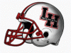
Ole Miss: Very bad. White jerseys over off-white pants look like a mistake was made in the equipment room, and remember: JUST SAY NO TO OVER-THE-SHOULDER STRIPES. Also, there has to be more white space around the writing on the helmet. The way it is now, the helmets look close to our old navy blue helmets with the red Mustang, which looked OK up close but were terrible from the stands and worse on TV.
Grade: D+
LaTech: See previous comment about over-the-shoulder stripes and correct that immediately. Stripes on the pants are way too thick. If going with the blue jersey, the helmet has to be either blue or white.
Grade: D
But back to the original topic: the uniforms. (Assessments here are based on the photos shown, as many schools have multiple options that aren't pictured.)
SMU: Any description other than "best uniform in the country" is inaccurate. It would be much better with royal blue jerseys and blue or white facemasks, but until Nike comes in and screws it up, we have great uniforms.
Grade: A-
Virginia: Pretty good, actually. A lot of blue/orange mixes look like crap (see Syracuse, UTEP, etc.), but UVa's is pretty sharp. Classic-but-not-overbearing logo. Sleeves aren't quite long enough, but better than the tucked-up-to-the-armpits stuff that is rampant everywhere.
Grade: B
Virginia Tech: Terrible. Anything with maroon and orange (in any style or combination) should be shredded immediately. There is no way to make that uniform look good, and the look with one colored sleeve should have gotten someone fired. Multiple people, actually -- whoever designed it, and whoever agreed to let a team play in it.
Grade: F
Rutgers: Excellent. Might change the font of the number on the jersey, but other than that, it's a clean look that really works (although red in the jersey and helmet don't quite match. That must be corrected.)
Grade: B+
Syracuse: See the comment above about blue and orange not going well together. The white basketball uniforms with orange only are OK, but this crap looks like something that shouldn't be forced on anyone above a youth recreational league that gets its uniforms donated by the local dry cleaner or tire store.
Grade: D-
Baylor: Burn them. This is disgusting. The colors are awful, as if someone in Notre Dame's (also-ugly) green jerseys slept with one of the Oakland A's. The metallic helmet is a different shade of yellow/gold/vomit than the pants, and the green and white stripes make an already-ugly helmet worse. Perfect for Baylor and Waco, come to think of it.
Grade: D-
Kansas State: Not bad, which is surprising for something that uses a color even close to TCU's purple (they're close, but not identical). Sleeve stripes are a little awkward and too thick. K-State logo is classic.
B-
Oklahoma State: T. Boone Pickens gives the school a bazillion dollars and they come up with THAT? Stop letting blind people design uniforms, Nike!
Grade: F
Marshall: This shade of green looks like artificial turf, but the design is surprisingly good here. Very simple and clean, with traditional-looking logo and understated black accents on the helmet and trim around the numbers. This pic looks a lot better than I remember from SMU/Marshall games (and the Rice uniform in the picture is excellent).
Grade: B+
Air Force: Very good except for the white piping down the jersey and the silly panel on the sides. Other than that, a nice look (hey Nike: blue jerseys ... blue jerseys ... blue jerseys ...)
Grade: B-
New Mexico: Not bad, although this look underscores the idea that jerseys need to have actual sleeves or no stripes, or both. Sleeve stripes are not supposed to have ends - they're supposed to go all the way around the arm. The stripes on the side of the pants also should be thinner.
Grade: C
Cal: NO! Looks like a Michigan Wolverine threw up. The tapering stripe down the middle of the helmet is never acceptable (see the Denver Broncos' stupid-looking helmets), and what are those crazy curved stripes on the side of the players' hips? Handles? Also, if a team has to wear black socks (and no team has to wear black socks - they look stupid), then any shoes that are not black are simply unacceptable. All three of the players shown appear to have more white than black in their shoes, which look ridiculous when worn with black socks. Get rid of the black socks immediately.
Grade: D
Colorado: Great uniform. CU's logo is one of the best in the country, and this wouldn't work if they tried to go Pittsburgh Steelers on us with a bright yellow. But with the understated gold like this, the uniform works well.
Grade: B
Ole Miss: Very bad. White jerseys over off-white pants look like a mistake was made in the equipment room, and remember: JUST SAY NO TO OVER-THE-SHOULDER STRIPES. Also, there has to be more white space around the writing on the helmet. The way it is now, the helmets look close to our old navy blue helmets with the red Mustang, which looked OK up close but were terrible from the stands and worse on TV.
Grade: D+
LaTech: See previous comment about over-the-shoulder stripes and correct that immediately. Stripes on the pants are way too thick. If going with the blue jersey, the helmet has to be either blue or white.
Grade: D
-
redpony
- PonyFans.com Super Legend
- Posts: 10968
- Joined: Tue Jan 01, 2008 8:44 am
- Location: on the beach,northern Peru
Re: Underrated Uniforms
giacfsp wrote:Congratulations on telling the incoming freshmen that they're not great players and they were some kind of afterthoughts. Couldn't be further from the truth, and once and for all, just because the coaches don't rush to the pay sites to say "I made a phone call! I sent a letter!" doesn't mean they're not recruiting.
gia- when JJ starts signing Texas top 100 players and occasionally gets a top 100 US player then he can say he is getting great players. cougar high snagged a top US receiver, the pirate kicked JJ's [deleted]. Those are the things that I am referring to. How many Texas top 100 did we sign this year?
OK- we just disagree on his recruiting. next topic

Re: Underrated Uniforms
Our current helmet, with La Tech's jerseys and pants would look good!!! 
-
Bergermeister
- PonyFans.com Super Legend
- Posts: 7132
- Joined: Sun Jul 28, 2002 3:01 am
- Location: University Park
Re: Underrated Uniforms
redpony wrote: next topic
finally.
-
Mitch McConnell
- Hall of Famer
- Posts: 2612
- Joined: Mon Nov 15, 2010 3:09 pm
Re: Underrated Uniforms
giacfsp wrote:Congratulations on telling the incoming freshmen that they're not great players and they were some kind of afterthoughts. Couldn't be further from the truth, and once and for all, just because the coaches don't rush to the pay sites to say "I made a phone call! I sent a letter!" doesn't mean they're not recruiting.
But back to the original topic: the uniforms. (Assessments here are based on the photos shown, as many schools have multiple options that aren't pictured.)
SMU: Any description other than "best uniform in the country" is inaccurate. It would be much better with royal blue jerseys and blue or white facemasks, but until Nike comes in and screws it up, we have great uniforms.
Grade: A-
Virginia: Pretty good, actually. A lot of blue/orange mixes look like crap (see Syracuse, UTEP, etc.), but UVa's is pretty sharp. Classic-but-not-overbearing logo. Sleeves aren't quite long enough, but better than the tucked-up-to-the-armpits stuff that is rampant everywhere.
Grade: B
Virginia Tech: Terrible. Anything with maroon and orange (in any style or combination) should be shredded immediately. There is no way to make that uniform look good, and the look with one colored sleeve should have gotten someone fired. Multiple people, actually -- whoever designed it, and whoever agreed to let a team play in it.
Grade: F
Rutgers: Excellent. Might change the font of the number on the jersey, but other than that, it's a clean look that really works (although red in the jersey and helmet don't quite match. That must be corrected.)
Grade: B+
Syracuse: See the comment above about blue and orange not going well together. The white basketball uniforms with orange only are OK, but this crap looks like something that shouldn't be forced on anyone above a youth recreational league that gets its uniforms donated by the local dry cleaner or tire store.
Grade: D-
Baylor: Burn them. This is disgusting. The colors are awful, as if someone in Notre Dame's (also-ugly) green jerseys slept with one of the Oakland A's. The metallic helmet is a different shade of yellow/gold/vomit than the pants, and the green and white stripes make an already-ugly helmet worse. Perfect for Baylor and Waco, come to think of it.
Grade: D-
Kansas State: Not bad, which is surprising for something that uses a color even close to TCU's purple (they're close, but not identical). Sleeve stripes are a little awkward and too thick. K-State logo is classic.
B-
Oklahoma State: T. Boone Pickens gives the school a bazillion dollars and they come up with THAT? Stop letting blind people design uniforms, Nike!
Grade: F
Marshall: This shade of green looks like artificial turf, but the design is surprisingly good here. Very simple and clean, with traditional-looking logo and understated black accents on the helmet and trim around the numbers. This pic looks a lot better than I remember from SMU/Marshall games (and the Rice uniform in the picture is excellent).
Grade: B+
Air Force: Very good except for the white piping down the jersey and the silly panel on the sides. Other than that, a nice look (hey Nike: blue jerseys ... blue jerseys ... blue jerseys ...)
Grade: B-
New Mexico: Not bad, although this look underscores the idea that jerseys need to have actual sleeves or no stripes, or both. Sleeve stripes are not supposed to have ends - they're supposed to go all the way around the arm. The stripes on the side of the pants also should be thinner.
Grade: C
Cal: NO! Looks like a Michigan Wolverine threw up. The tapering stripe down the middle of the helmet is never acceptable (see the Denver Broncos' stupid-looking helmets), and what are those crazy curved stripes on the side of the players' hips? Handles? Also, if a team has to wear black socks (and no team has to wear black socks - they look stupid), then any shoes that are not black are simply unacceptable. All three of the players shown appear to have more white than black in their shoes, which look ridiculous when worn with black socks. Get rid of the black socks immediately.
Grade: D
Colorado: Great uniform. CU's logo is one of the best in the country, and this wouldn't work if they tried to go Pittsburgh Steelers on us with a bright yellow. But with the understated gold like this, the uniform works well.
Grade: B
Ole Miss: Very bad. White jerseys over off-white pants look like a mistake was made in the equipment room, and remember: JUST SAY NO TO OVER-THE-SHOULDER STRIPES. Also, there has to be more white space around the writing on the helmet. The way it is now, the helmets look close to our old navy blue helmets with the red Mustang, which looked OK up close but were terrible from the stands and worse on TV.
Grade: D+
LaTech: See previous comment about over-the-shoulder stripes and correct that immediately. Stripes on the pants are way too thick. If going with the blue jersey, the helmet has to be either blue or white.
Grade: D
My reaction to your post...
