
New UofH Logo.
Moderators: PonyPride, SmooPower
-
SMUer

- PonyFans.com Super Legend

- Posts: 5276
- Joined: Sun Oct 28, 2007 12:03 pm
- Location: Dallas, Texas, The United States of America
Re: New UofH Logo.
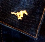
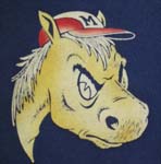
Looks like This...

Bred with This...

Bred with This...
-
SMUer
- PonyFans.com Super Legend
- Posts: 5276
- Joined: Sun Oct 28, 2007 12:03 pm
- Location: Dallas, Texas, The United States of America
Re: New UofH Logo.
New script too
-
austinponie
- All-American

- Posts: 726
- Joined: Tue Dec 28, 2010 11:08 am
Re: New UofH Logo.
I like it.
Need more blue in the unis. The all red's a little overwhelming...
Need more blue in the unis. The all red's a little overwhelming...
-
Bergermeister
- PonyFans.com Super Legend
- Posts: 7132
- Joined: Sun Jul 28, 2002 3:01 am
- Location: University Park
Re: New UofH Logo.
idiocracy at its finest - that's what happens at schools that either have no tradition or have no respect for tradition.
-
SMUer
- PonyFans.com Super Legend
- Posts: 5276
- Joined: Sun Oct 28, 2007 12:03 pm
- Location: Dallas, Texas, The United States of America
Re: New UofH Logo.
UH is basically a commuter school to which most students feel little affinity with except for their sports teams. They must think this'll look cool on t-shirts and hats. It will. But they won't look like UH anymore; they'll be the Houston Thundercats.
-
PK

- PonyFans.com Super Legend
- Posts: 8805
- Joined: Wed Sep 06, 2000 3:01 am
- Location: Dallas, Texas 75206
Re: New UofH Logo.
Are they changing their school colors to red and blue? We should sue. 
SMU's first president, Robert S. Hyer, selected Harvard Crimson and Yale Blue as SMU's colors to symbolize SMU's high academic standards. We are one of the few Universities to have school colors with real meaning...and we just blow them off.
-
DanFreibergerForHeisman

- PonyFans.com Super Legend
- Posts: 16486
- Joined: Mon Jul 24, 2000 3:01 am
- Contact:
Re: New UofH Logo.
The beveling on their new UH is just terrible.
It's actually kind of funny the three Texas schools with amateur beveling in their logos are A&M, Tech, and Houston - all pretty similar schools.
It's actually kind of funny the three Texas schools with amateur beveling in their logos are A&M, Tech, and Houston - all pretty similar schools.
Shake It Off Moody
-
gostangs
- PonyFans.com Super Legend
- Posts: 12315
- Joined: Mon Dec 02, 2002 4:01 am
- Location: Dallas, Texas USA
Re: New UofH Logo.
beveling? what the heck is that?
-
DanFreibergerForHeisman
- PonyFans.com Super Legend
- Posts: 16486
- Joined: Mon Jul 24, 2000 3:01 am
- Contact:
Re: New UofH Logo.
gostangs wrote:beveling? what the heck is that?
The silly shading and stuff they do to make it look like it is carved out of marble or something.
You think we argue about uniforms and colors here - they have pages and pages of arguments about the beveling on the Texas A&M logo on the aggie message boards...
Of course, I should withhold any ripping of other logos and wordmarks until I see what Nike does with us.
Shake It Off Moody


Re: New UofH Logo.
SMUer wrote: they'll be the Houston Thundercats.
Nice!
-CoS
-
bubba pony
- Heisman

- Posts: 1560
- Joined: Fri May 30, 2003 3:01 am
Re: New UofH Logo.
reminds me when NE Partiots went from a cool logo to a too modern one.
the unsung palyer center. not a flashy postion

to this

the unsung palyer center. not a flashy postion
to this
-
SMUer
- PonyFans.com Super Legend
- Posts: 5276
- Joined: Sun Oct 28, 2007 12:03 pm
- Location: Dallas, Texas, The United States of America
Re: New UofH Logo.
The Flying Elvi
-
redpony
- PonyFans.com Super Legend
- Posts: 10968
- Joined: Tue Jan 01, 2008 8:44 am
- Location: on the beach,northern Peru
Re: New UofH Logo.
Obviously looks like it was designed by 7-11 studios. 


Re: New UofH Logo.
I'm not crazy about it - I'd like for them to stick with their traditional colors; the simple red and white works well.
It's also kind of generic, although the same could be said for the "UH" logo.
It's also kind of generic, although the same could be said for the "UH" logo.