SoCal_Pony,
You asked me my thoughts on the 2010 Armed Forces Bowl Jerseys and the 1983 Retro Uniform.
2010 Armed Forces Bowl Jerseys:I am somewhat split on this subject. I truly like the idea when schools tweak their uniforms for a bowl game (see example below: TCU and Purdue adding a rose to their helmet decal).

I believe the uniform could have looked worse. I wouldn't say it looked good, but it definitely could have been worse. What I didn't understand was the reasoning of wearing our competition's color to honor them. There are several ways to honor your opponent and the military without wearing their colors. Since we lost the game it really makes the black uniforms feel like a half baked idea. My theory is June (and probably the team) wanted black jerseys and that was the easiest way to justify it.
From a marketing/brand standpoint it was stupid. A bowl game is an excellent avenue to showcase your school to the rest of the country and we decided to wear our opponents colors. I imagine it was very confusing at times to an average college football fan watching the game to figure out which team was which.
At the end of the day, my critique is not necessarily on the design of the black jerseys (they were our primary Adidas jersey pattern recolored), but the reasoning behind it. Like I stated earlier, to me it seemed illogical, half baked, and was a poor marketing decision.
As far as tweaking uniforms for bowl games, I thought it would have been cool to do an alternate decal for our white helmets for the Hawaii Bowl last year (similar to the TCU and Purdue rose bowl decals). I saw a design (maybe on a t-shirt or greek shirt) with Peruna donning a Hawaiian lei. Although I do not have the image, I recreated a similar one below. It would have been a small tweak, to honor the team for making a bowl game.
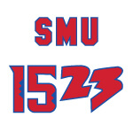
 1983 Retro Uniform
First off, I would like to applaud our excellent AD, Rick Hart for listening and making changes. Rick seems to understand tradition and branding. I cannot praise Rick Hart enough for bringing back the blue jerseys.
As far as the critique goes, it wasn't necessarily a 1983 retro uniform, it was a 1983 retro jersey and they also missed a few key things:
- No stripes on the pants
- Font, Font Height, and Kerning (spacing between letters) were all off
- Helmet stripe was too thin (and honestly is too thin for any SMU football uniform)
To pull off a retro uniform, SMU cannot overlook this kind of stuff. Detail is extremely important in design work. I give SMU a B+ for effort for the 1983 retro uniforms. Also, the original mockup that was released from the athletic department looked a lot better than what was actually produced (you must execute all the way through production, someone somewhere has to be approving the work).

Thank you very much for your compliments!
-SMU1523